CASE 03 / BRAND IDENTITY SYSTEM

Saga

SUSTAINABLE ANTHROPICITY
GREEN ARCHITECTURE
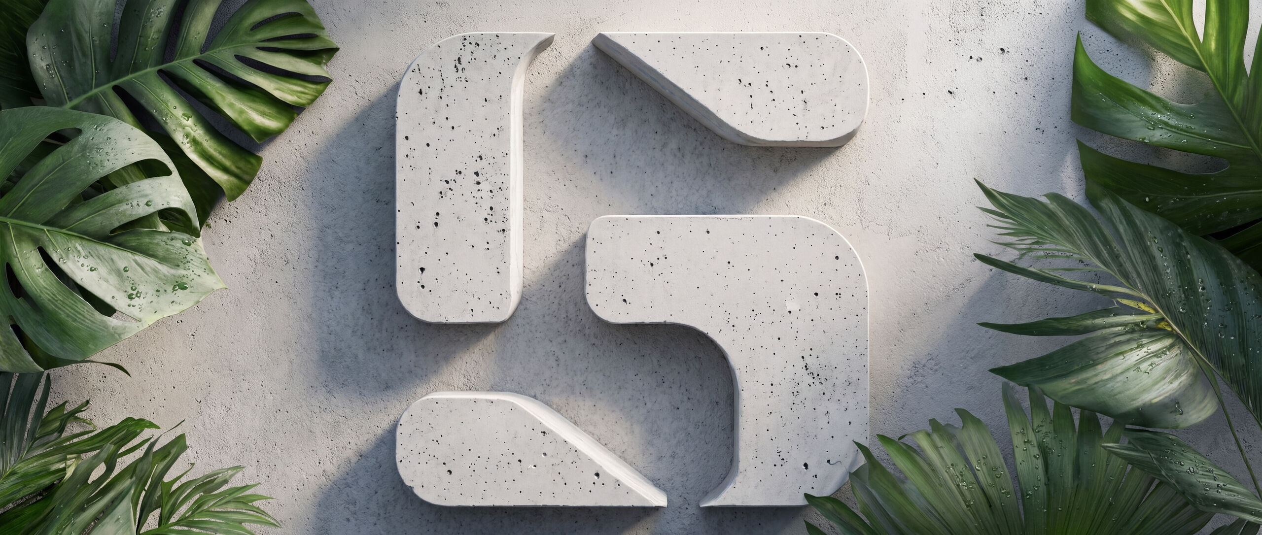
The Saga symbol cast as a concrete relief on a wall, raking light across the aggregate, monstera and fan palm crowding in from both edges
BRANDSAGA
SECTORARCHITECTURE
SCOPEMARK → SYSTEM → ENVIRONMENT
COLOURS4
PLATES10

One symbol.
Every letter.
Same parts.

SAGA is an acronym — Sustainable Anthropic Green Architecture — and the practice builds homes centred on both the people in them and the land around them. The identity had to carry that warmth without slipping into the softness the category defaults to.

So the symbol is modular rather than drawn. Its pieces assemble into an S, and the same pieces rearrange to form the other letters of the name — A, G and A. One kit of parts, four letters, which is the practice's own argument about building made visible in the mark.

Everything around it is set to read friendly rather than austere: deep forest and a cream that behaves like paper, one warm coral reserved for the things people wear and carry, and applications that all assume a leaf shadow across them.

Building a better
future together.

The mark

FIG.01 — FIG.03 / CONSTRUCTION AND KEY VISUAL
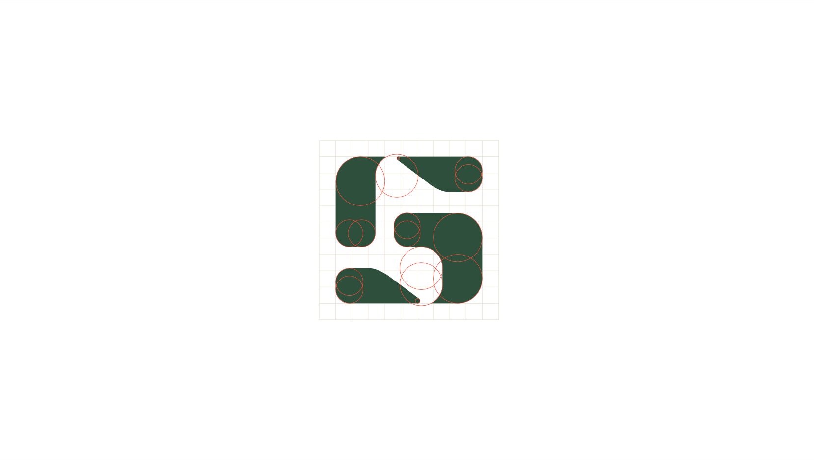

FIG.01 — the Saga S on its construction grid, showing the modular pieces that also assemble into the other letters of the name
FIG.01SYMBOL — MODULAR CONSTRUCTION
FIG.02 — the Saga symbol in cream on a soft green gradient field
FIG.02SYMBOL — GREEN FIELD
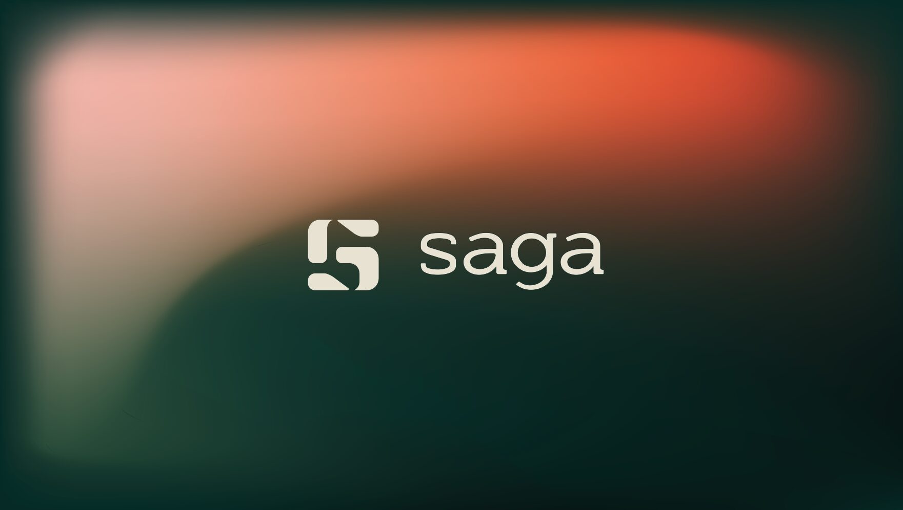
FIG.03 — the horizontal Saga lockup, symbol plus lowercase wordmark, on a coral-into-green gradient
FIG.03LOCKUP — WARM GRADIENT

The palette

COLOUR — MEASURED OFF THE ARTWORK

Forest

#0A1F1C GROUND

Field Green

#2E4D38 SIGNAGE + PRINT

Cream

#FCF9EA THE MARK

Coral

#EE4E36 WORN + CARRIED ONLY
1SYMBOL
4COLOURS
7APPLICATIONS
10PLATES

On the ground

FIG.04 — FIG.10 / APPLICATIONS
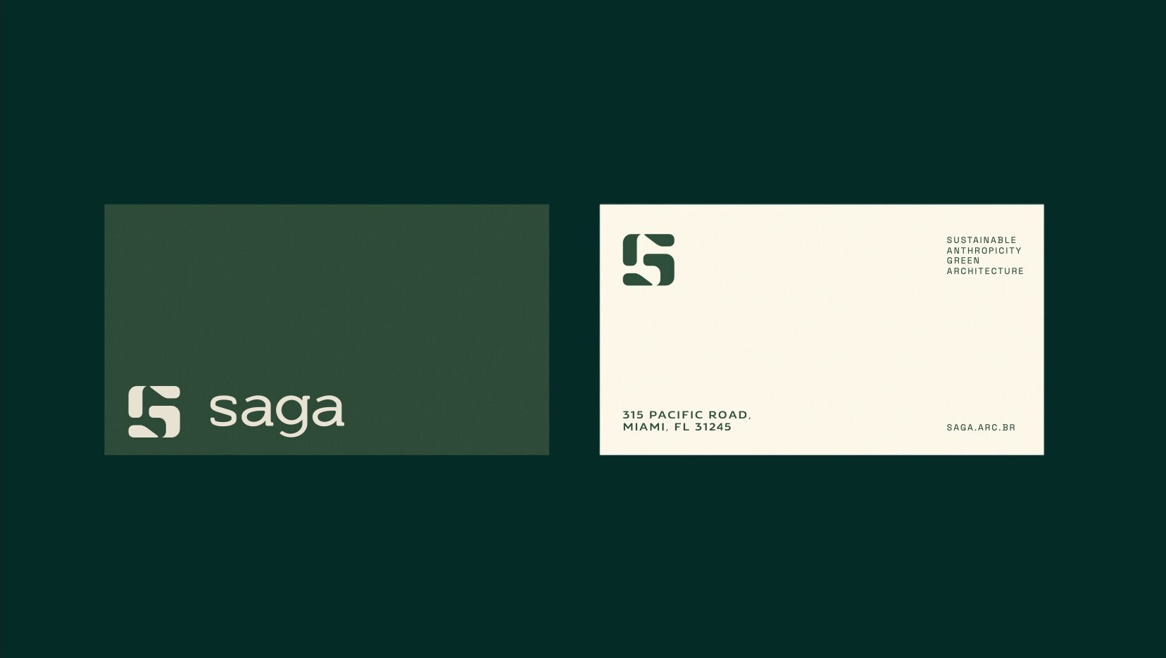
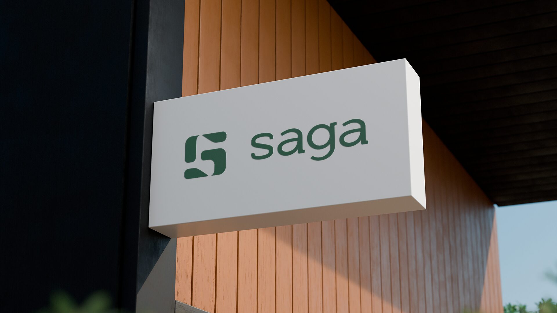
FIG.04 — both faces of the Saga business card, cream lockup on green and the contact face carrying the practice descriptor and address
FIG.04STATIONERY — BUSINESS CARD
FIG.05 — a white projecting box sign carrying the Saga lockup in green, mounted on a slatted timber facade
FIG.05SIGNAGE — FACADE BOX
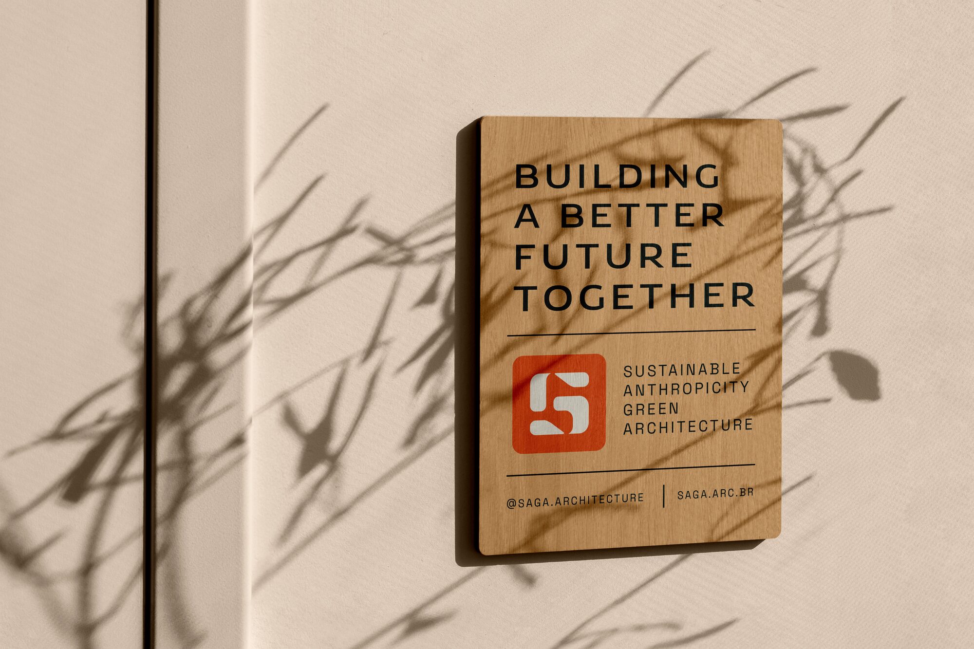
FIG.06 — a timber plaque reading BUILDING A BETTER FUTURE TOGETHER with the coral symbol tile and practice descriptor beneath
FIG.06SIGNAGE — TIMBER PLAQUE
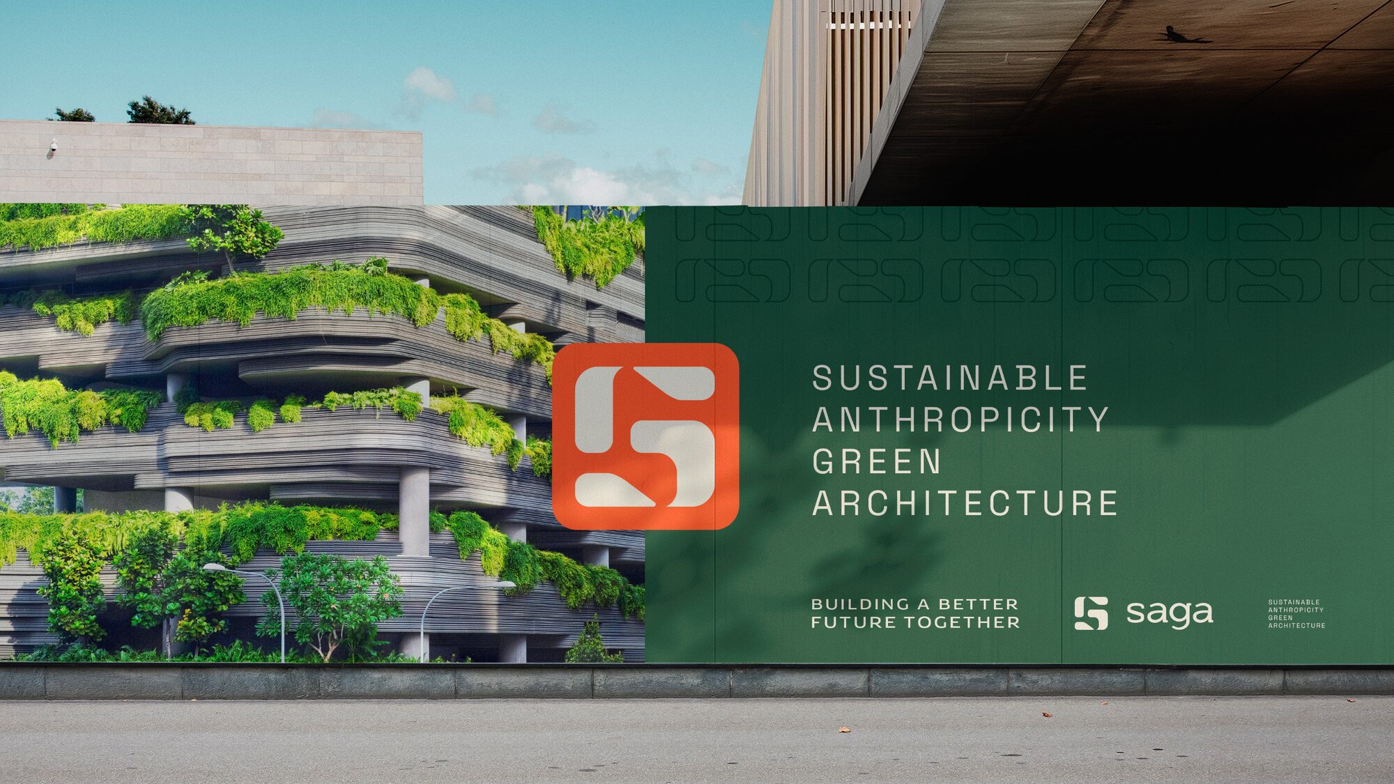
FIG.07 — green site hoarding in front of a planted terraced building, carrying the coral symbol and the practice descriptor
FIG.07SITE — HOARDING
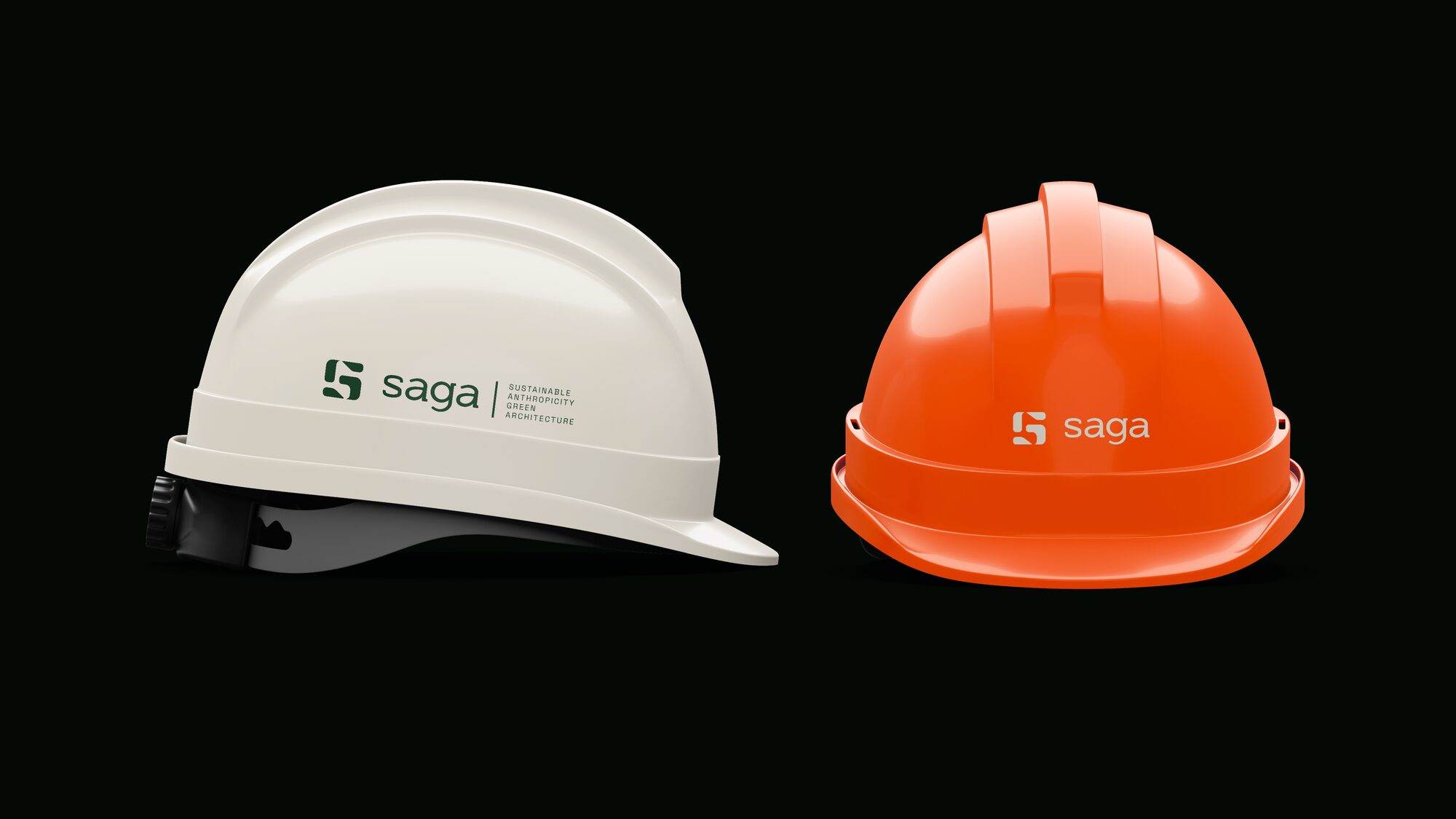
FIG.08 — two site helmets, one white and one coral, each carrying the Saga lockup
FIG.08SITE — HELMETS
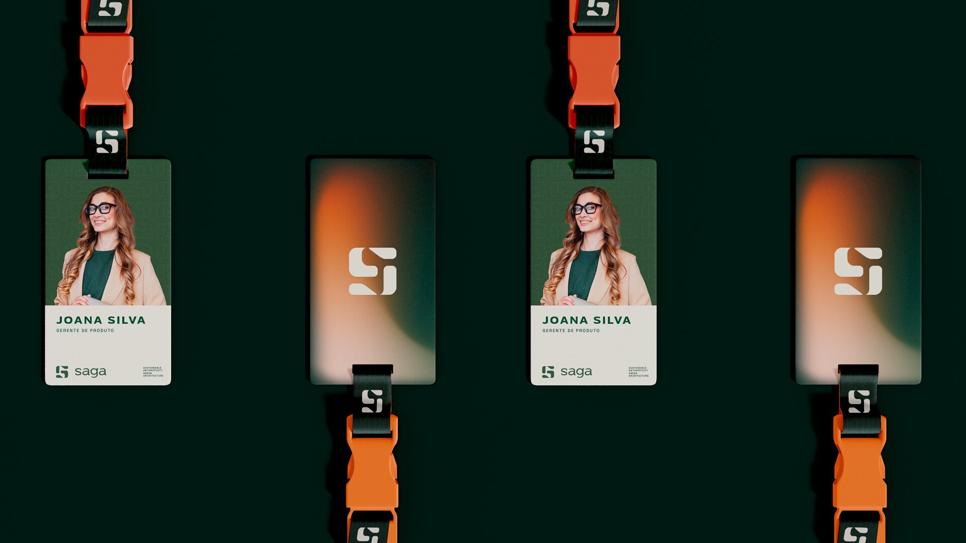
FIG.09 — staff passes on coral lanyards, front and back, on a forest green ground
FIG.09CREDENTIALS — PASSES
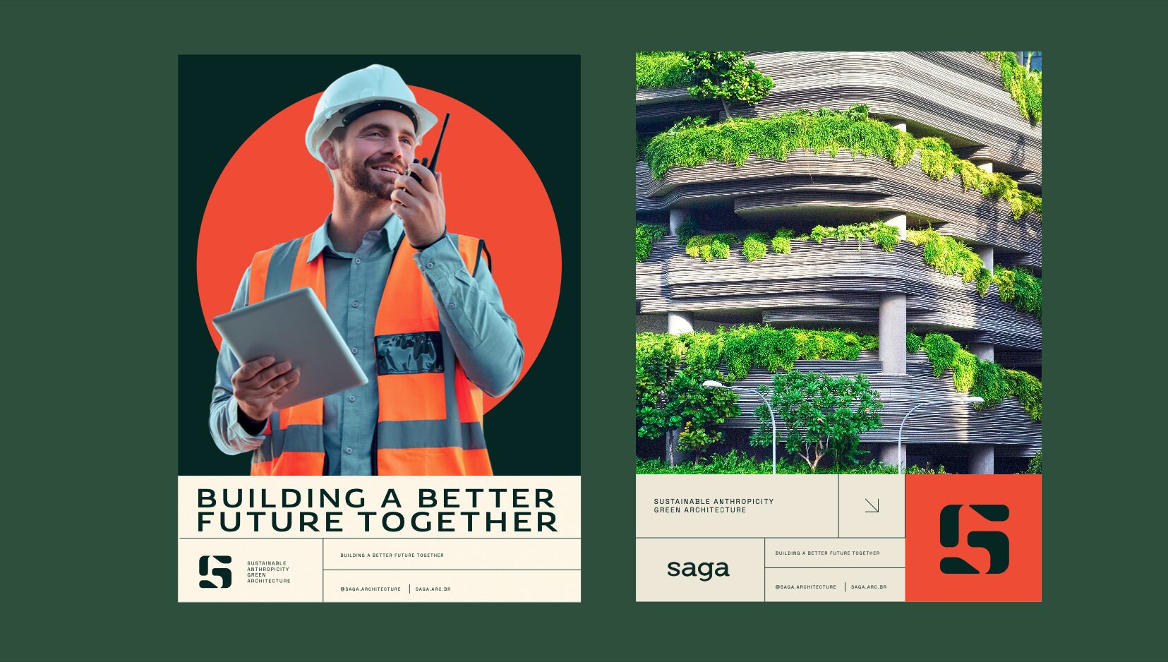
FIG.10 — a poster pair, one with a coral portrait roundel and the headline BUILDING A BETTER FUTURE TOGETHER, one with a planted facade photograph
FIG.10PRINT — POSTER PAIR

FIG.01–FIG.10 ARE THE SYSTEM'S OWN ARTWORK, UNTOUCHED. THE HERO BAND IS THE BRAND'S OWN FRAME REMASTERED WITH NANO BANANA PRO AT 4K FROM THE ORIGINAL AS REFERENCE, THEN DOWNSCALED TO 2560 PX FOR DELIVERY.