CASE 05 / BRAND IDENTITY SYSTEM
Objet
PREMIUM FURNITURE DESIGN
MARK · GRID · CHANNEL
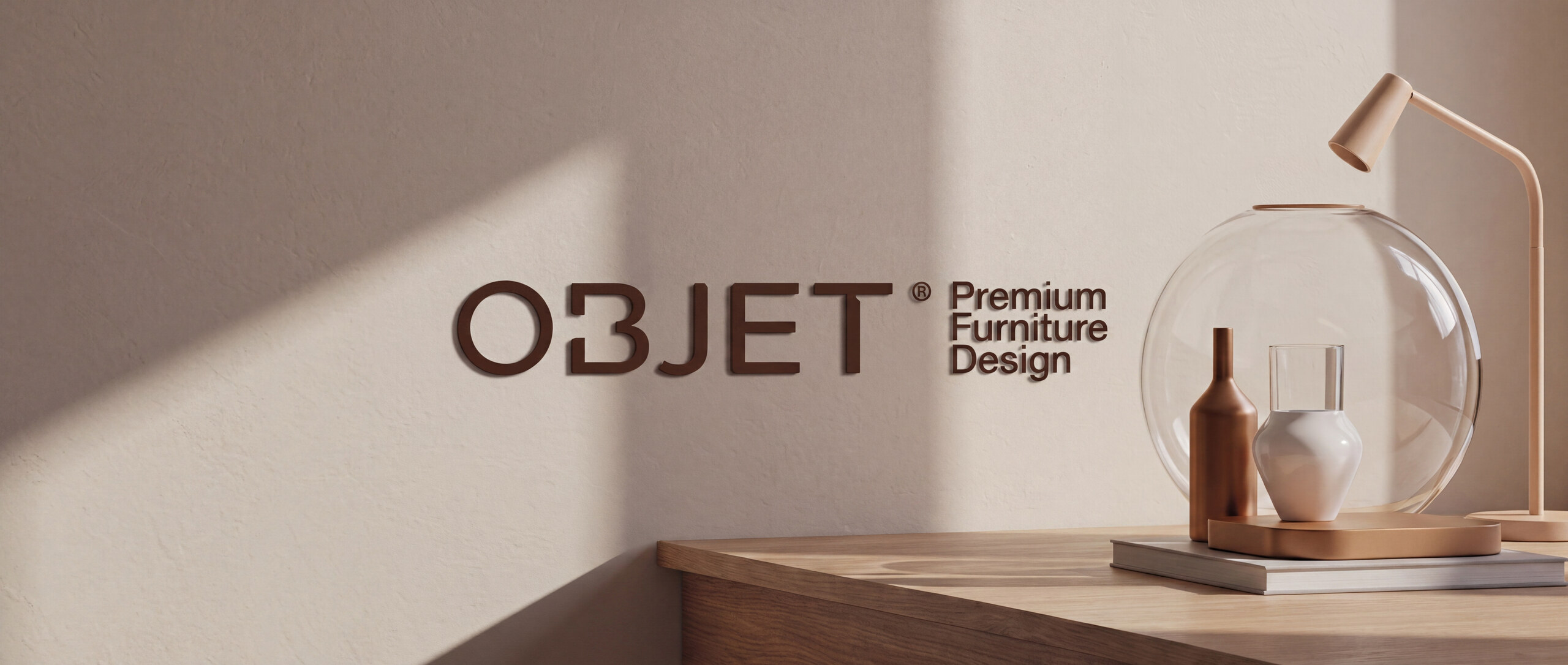
The mark is
made of the
objects.
Objet is a premium furniture brand built around designer-made objects — high-end, minimal, earthy, and completely uninterested in shouting. The identity had to behave like the products rather than sit on top of them.
So the wordmark is constructed the same way the furniture is: from a small set of minimal custom shapes, drawn to the same logic as the objects themselves. The letters are not set, they are built — which is why the mark reads as part of the catalogue rather than a label applied to it.
Around it, a modern typeface, earthy tones held on a grid, oxblood used as a field rather than an accent, and a great deal of deliberate empty wall. The system's confidence is in what it leaves out.
Premium
furniture design.
The system
FIG.01 / THE SYSTEM BOARD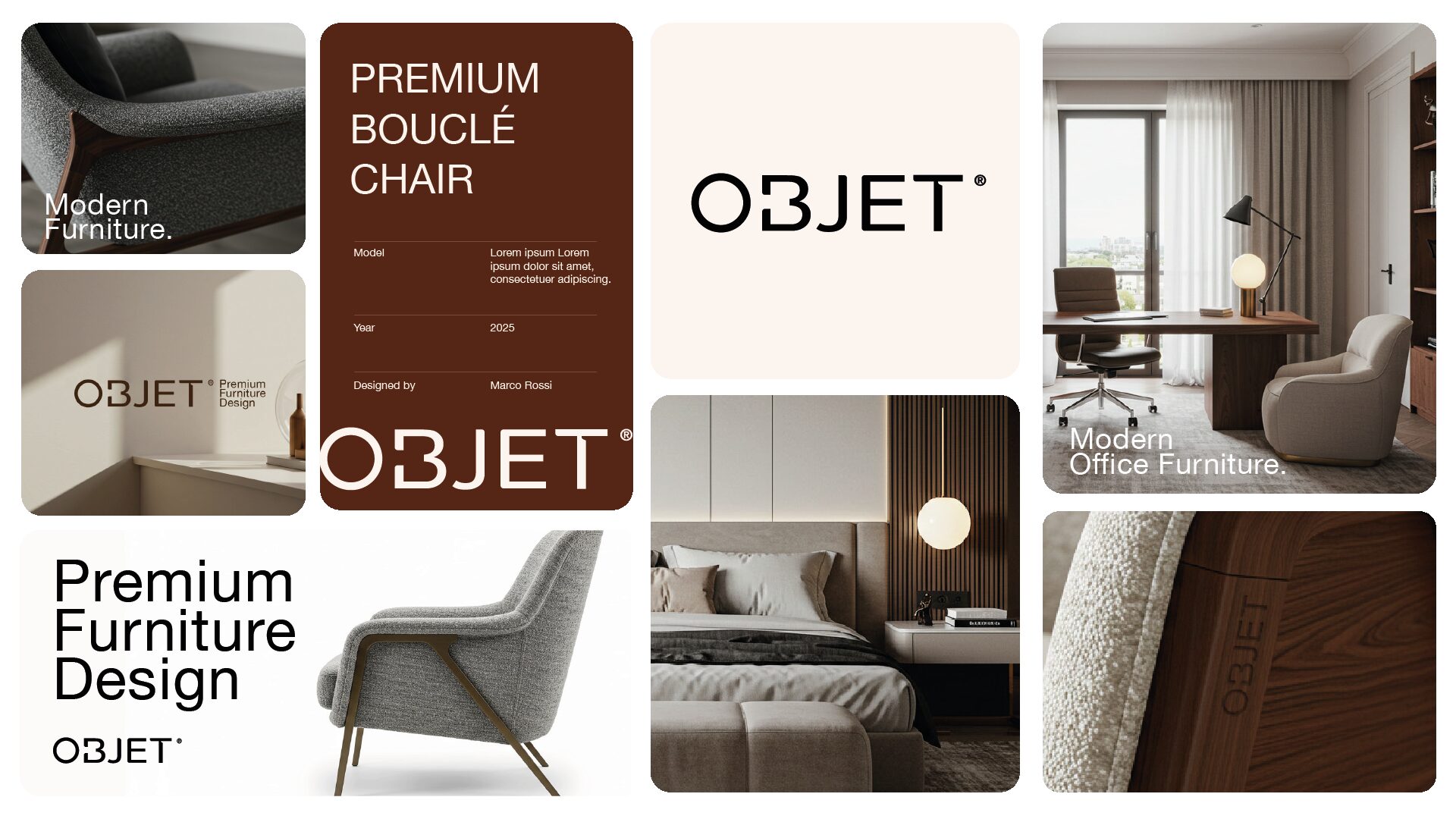
The palette
COLOUR — MEASURED OFF THE ARTWORKOxblood
#552515 FIELDCream
#FCF4EF PAPERTaupe
#8A7C73 MATERIALEspresso
#2D2119 TYPE + TIMBERIn channel
FIG.02 — FIG.05 / SITE, SOCIAL, MOBILE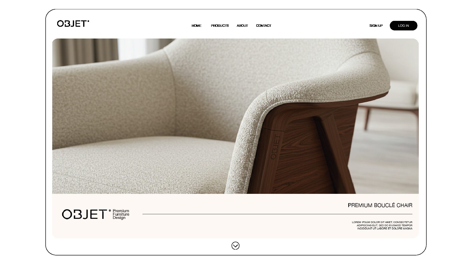
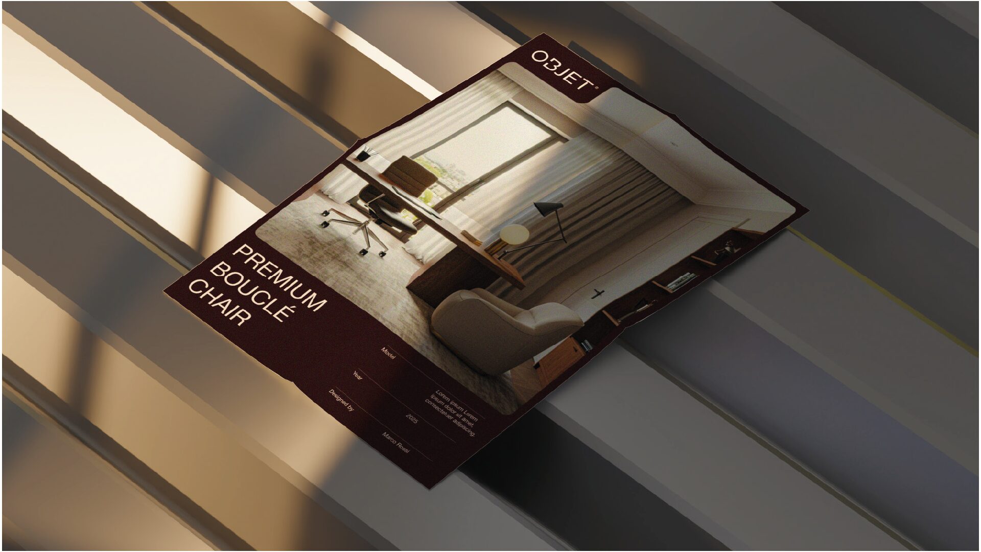
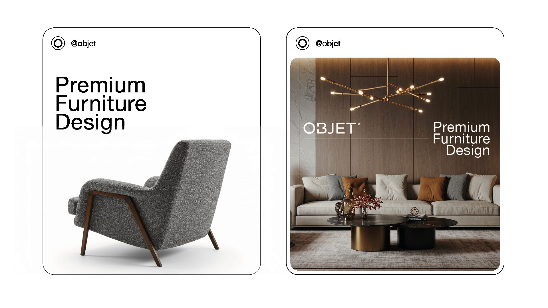
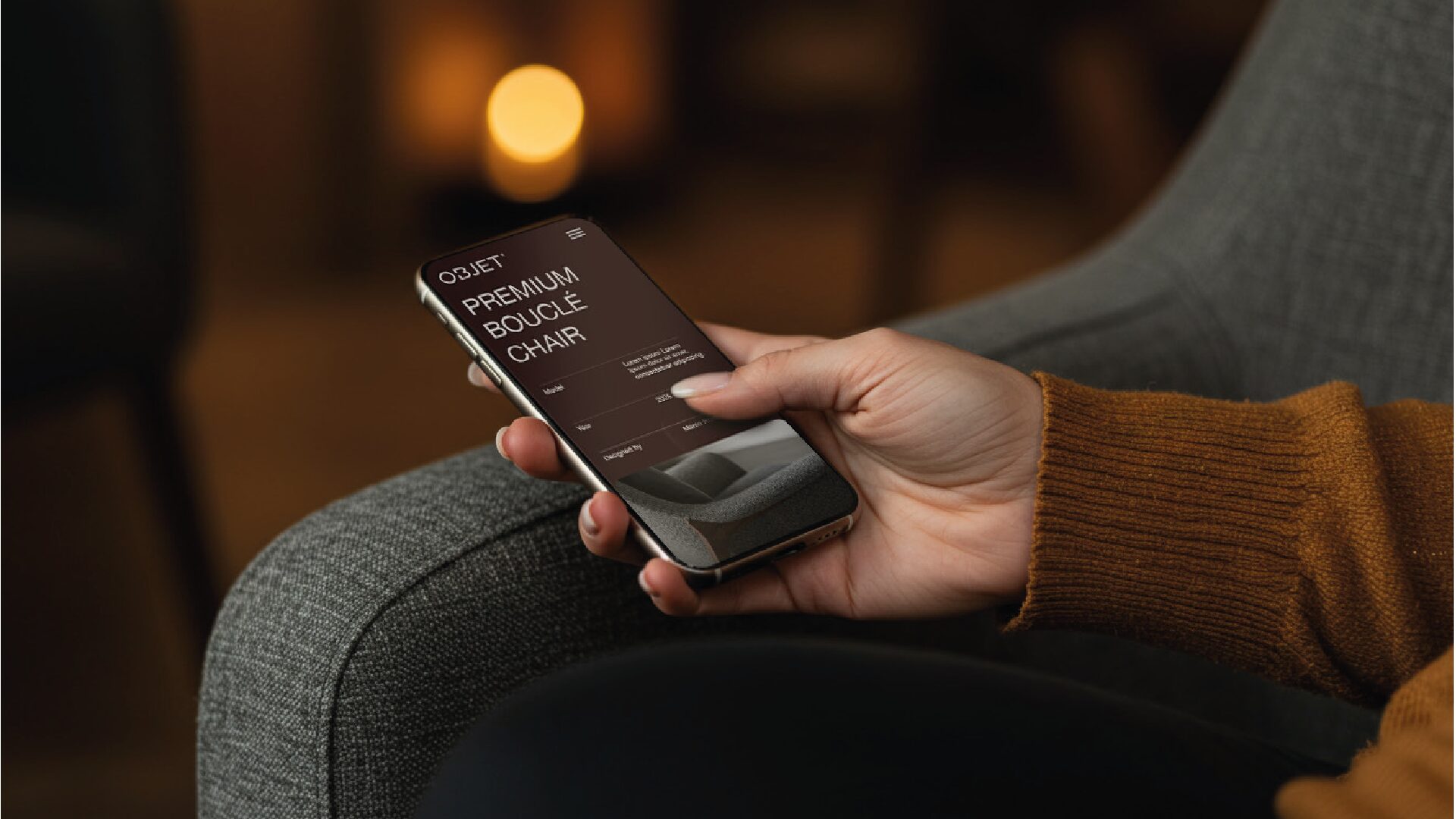
FIG.01–FIG.05 ARE THE SYSTEM'S OWN ARTWORK, UNTOUCHED. THE HERO BAND IS THE BRAND'S OWN FRAME REMASTERED WITH NANO BANANA PRO AT 4K FROM THE ORIGINAL AS REFERENCE, THEN DOWNSCALED TO 2560 PX FOR DELIVERY.