CASE 06 / BRAND IDENTITY SYSTEM
InTouch
Builders
NET ZERO SUSTAINABLE HOUSES
CONSCIOUSLY FINE TUNING OUR CRAFT
A fingerprint,
drawn as a
house.
InTouch Builders is an engineering company, and its whole proposition is that nothing it delivers is off the shelf: every project is drawn for the client it belongs to. The identity had to say bespoke in a category whose visual language is a roofline and a set square, repeated on every van on the street.
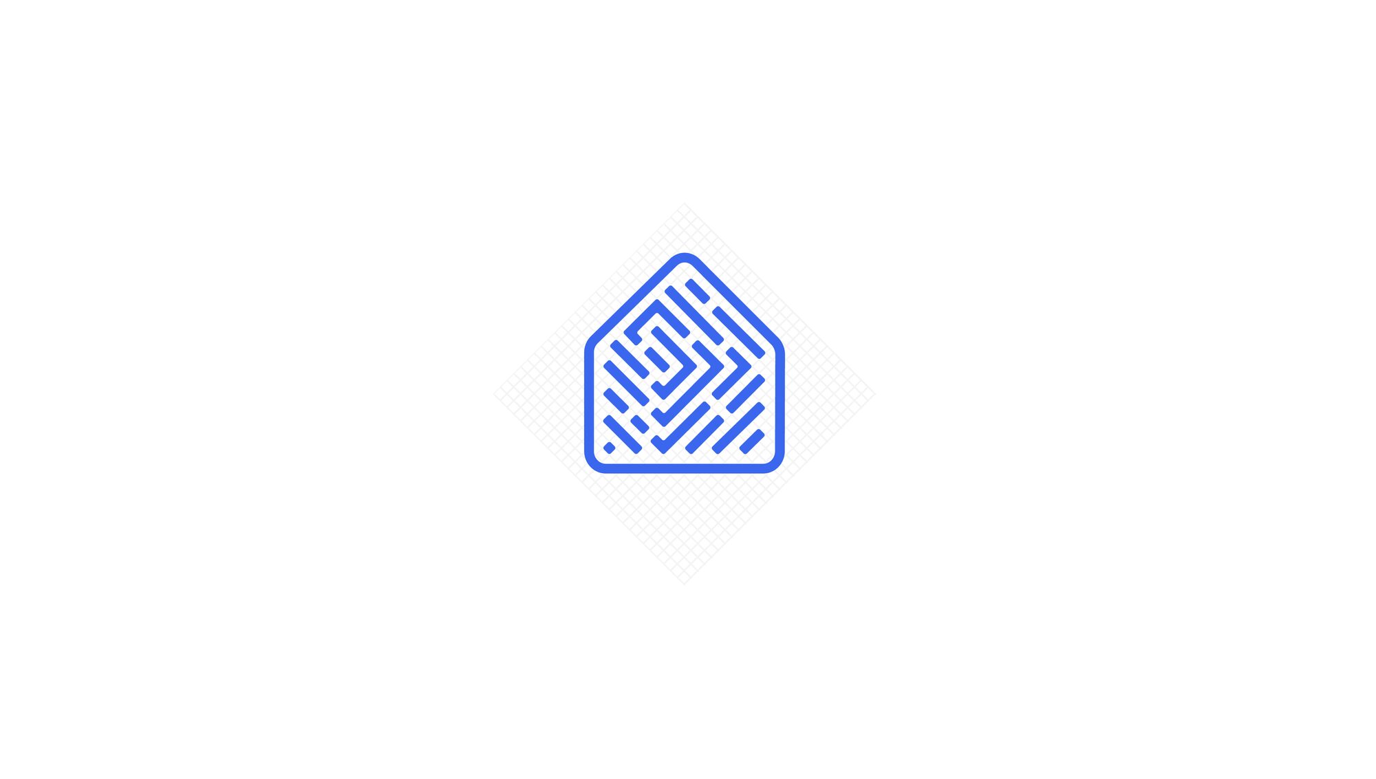
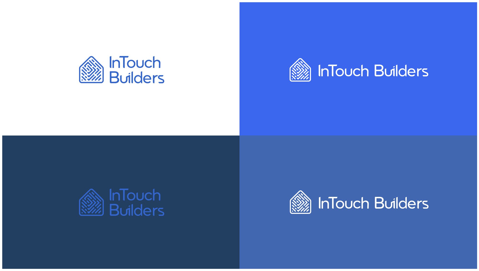
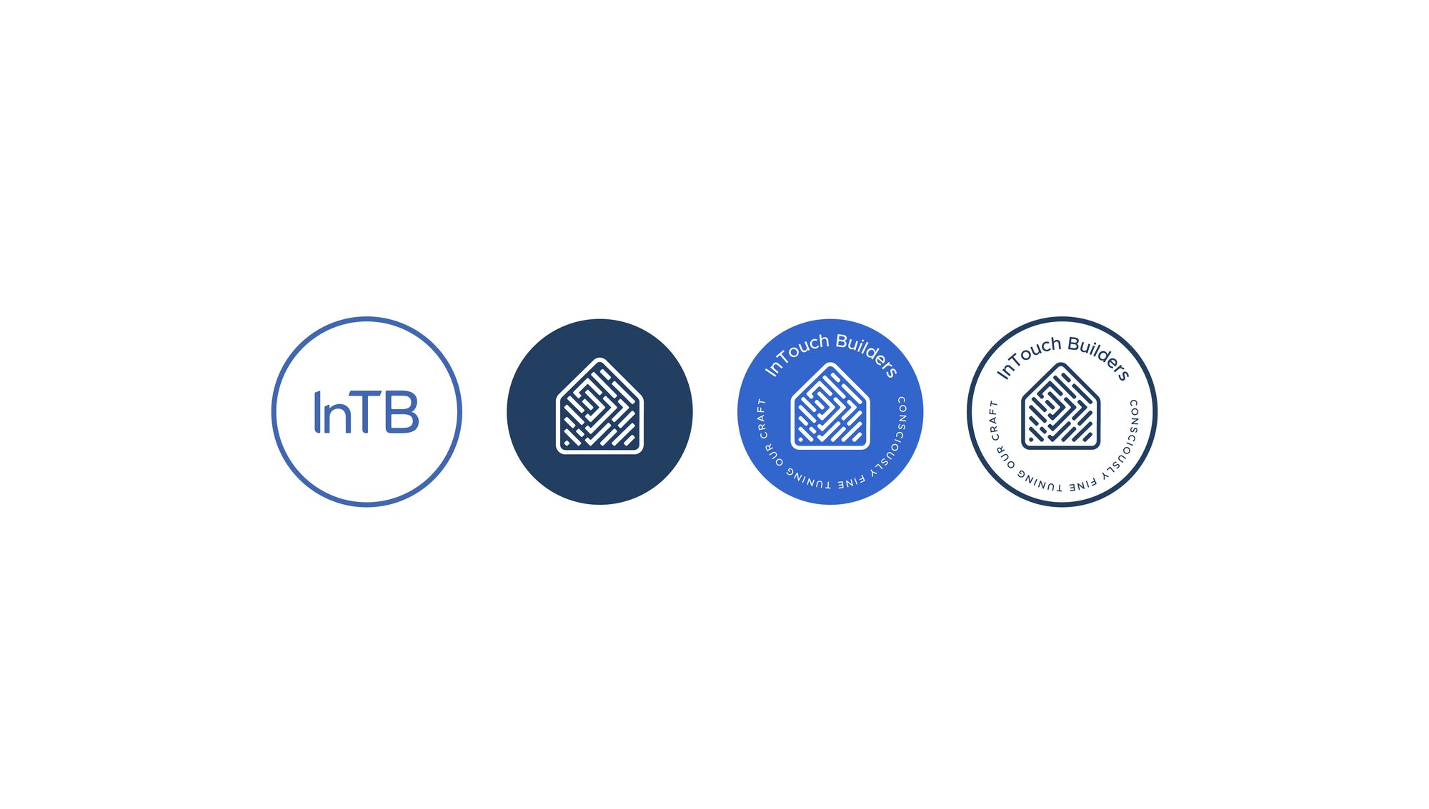
The mark crosses the two things the name already promises. A fingerprint stands for touch, handmade, custom, artisanal, unique. A house stands for airtight, protection, security, family. The mark is the fingerprint drawn inside the house outline, in even-weight squared-off lines that read as a print at distance and as a plan up close.
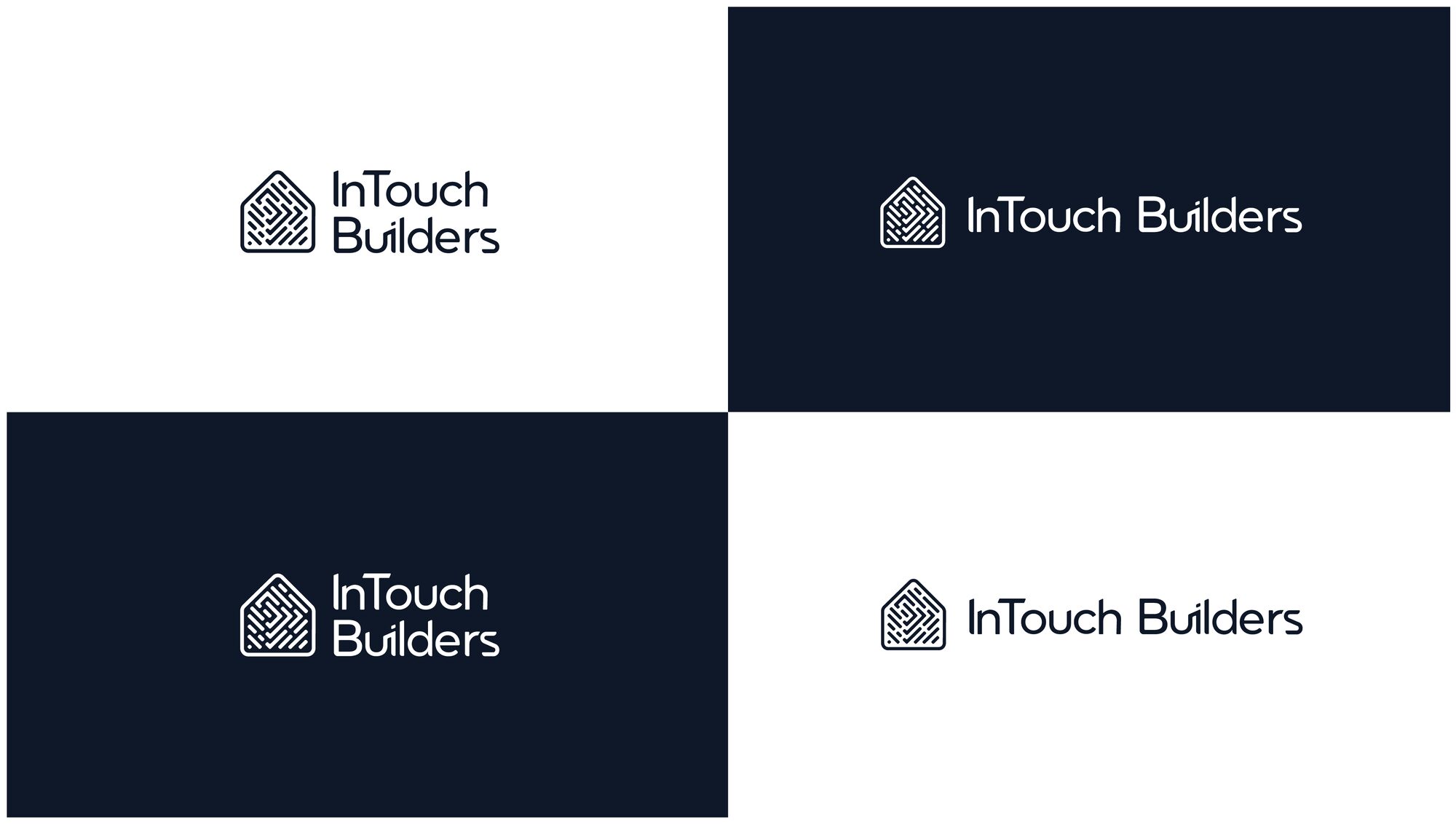
The line the whole thing hangs on is simple enough to say out loud: just as your fingerprint is uniquely your own, so is your home. From there it is a discipline problem, not an ideas problem — one mark, three Pantones, ten applications, and the same lockup surviving a business card, a hard hat, a truck door and a building facade.
Consciously fine
tuning our craft.
The mark
FIG.01 — FIG.06 / CONCEPT, LOCKUPS, VARIANTS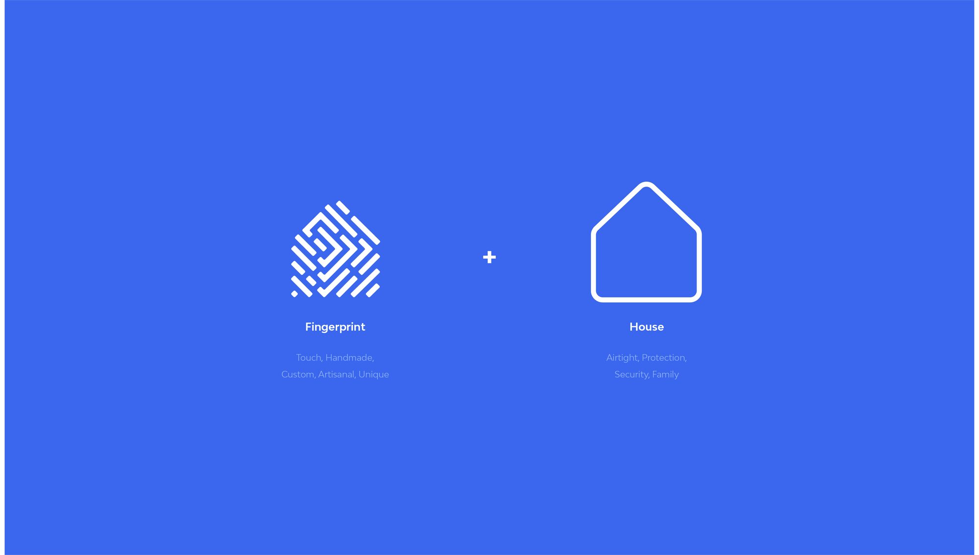
The palette
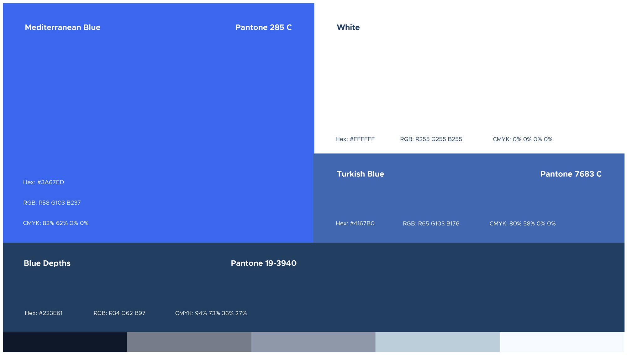
COLOUR — AS PUBLISHED ON THE BRAND'S OWN BOARDMediterranean Blue
PANTONE 285 C #3A67EDWhite
— #FFFFFFTurkish Blue
PANTONE 7683 C #4167B0Blue Depths
PANTONE 19-3940 #223E61On the job
FIG.08 — FIG.17 / APPLICATIONS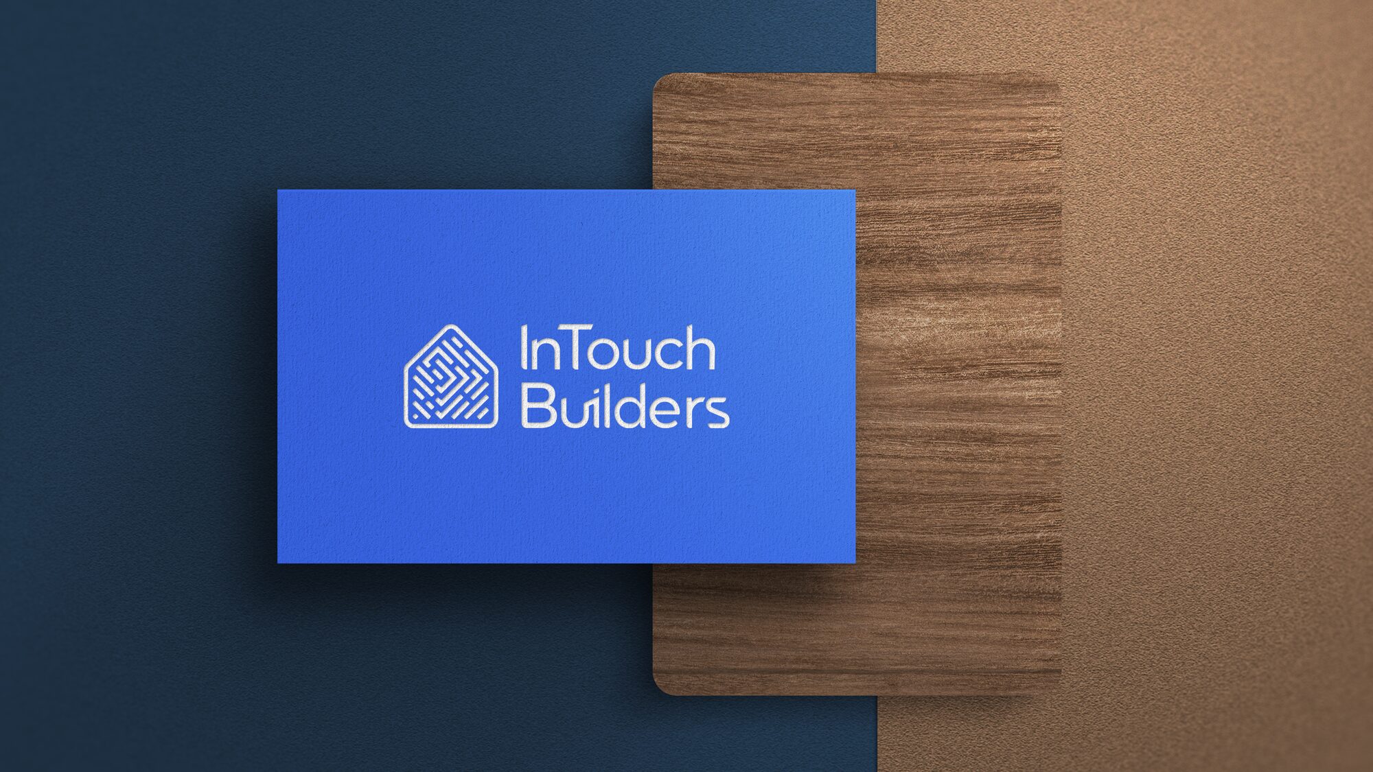
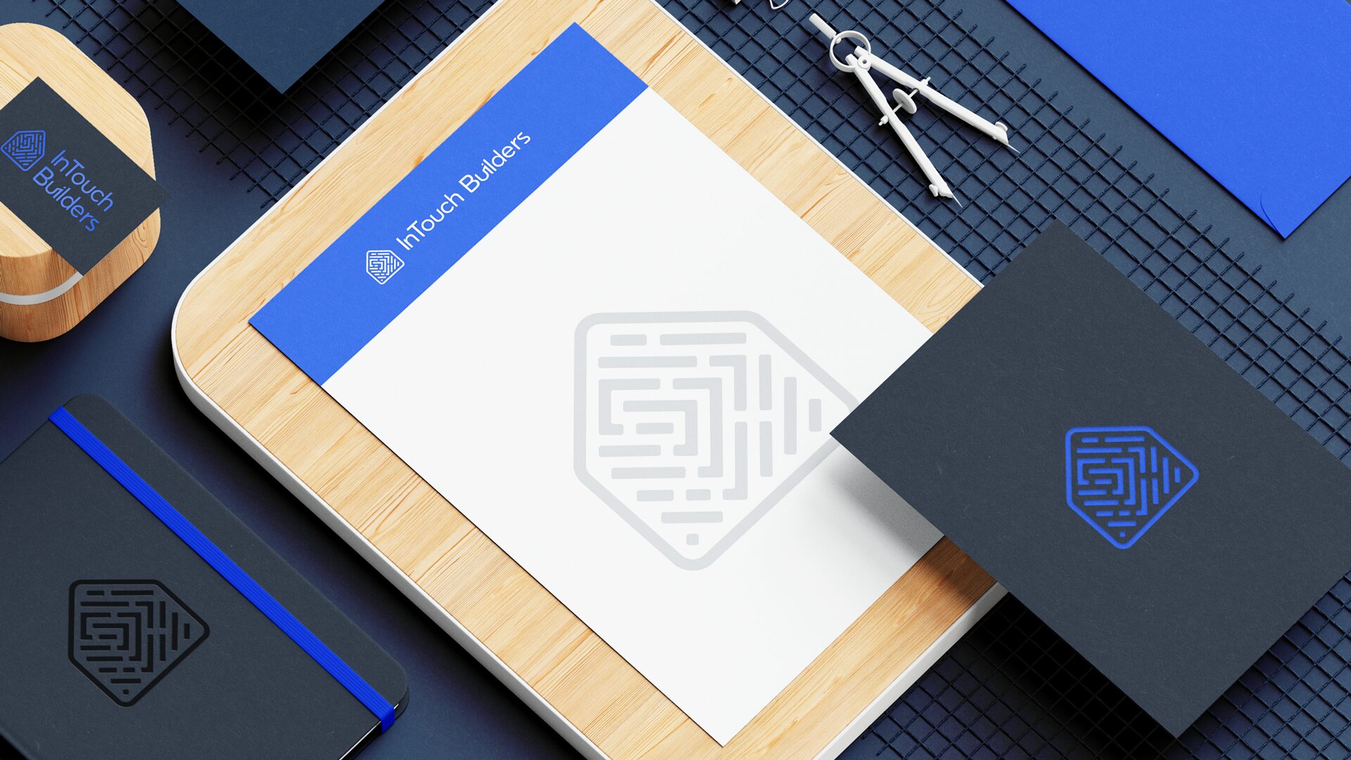
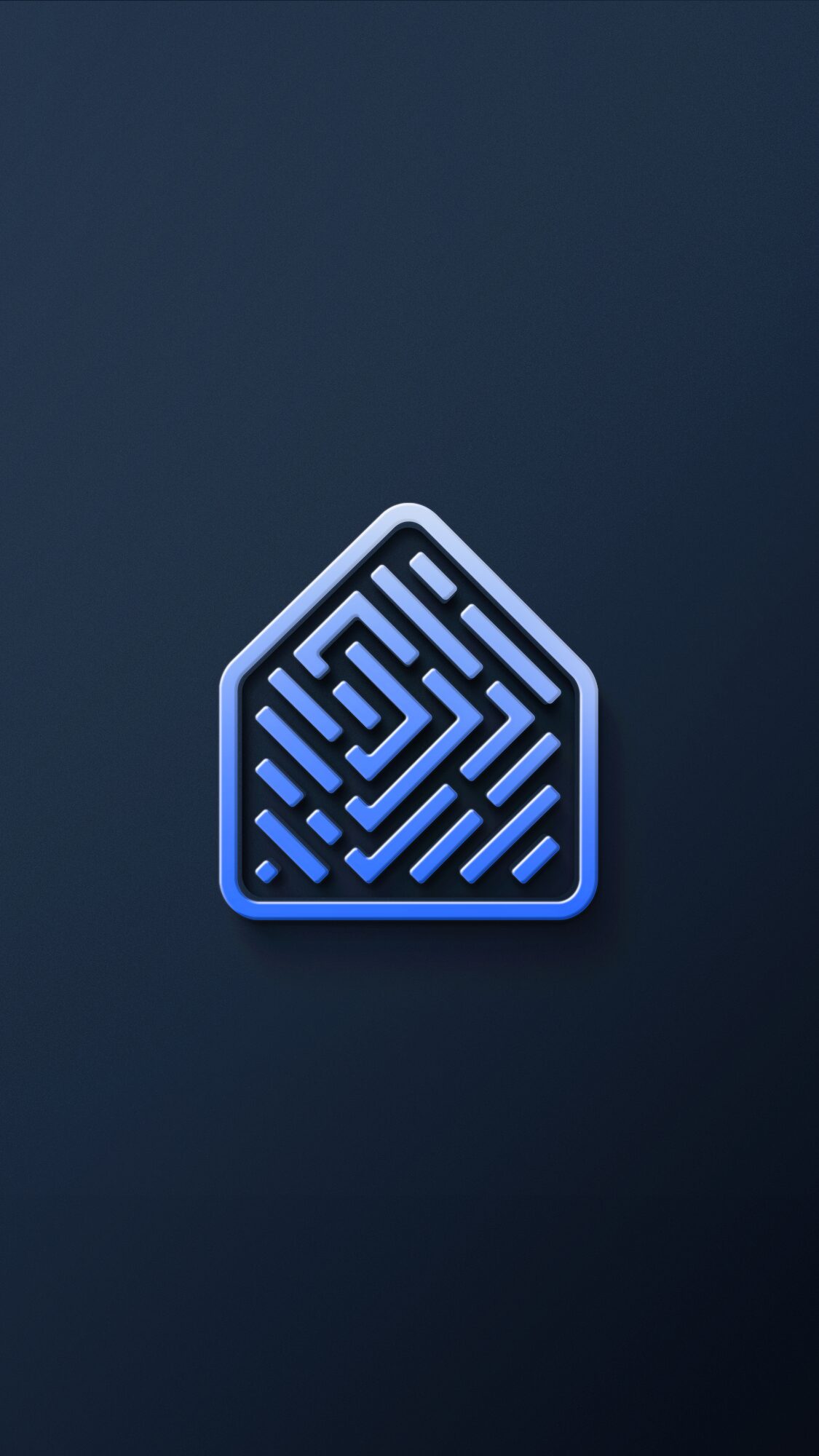
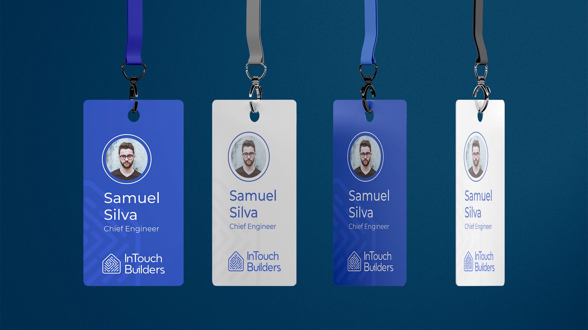
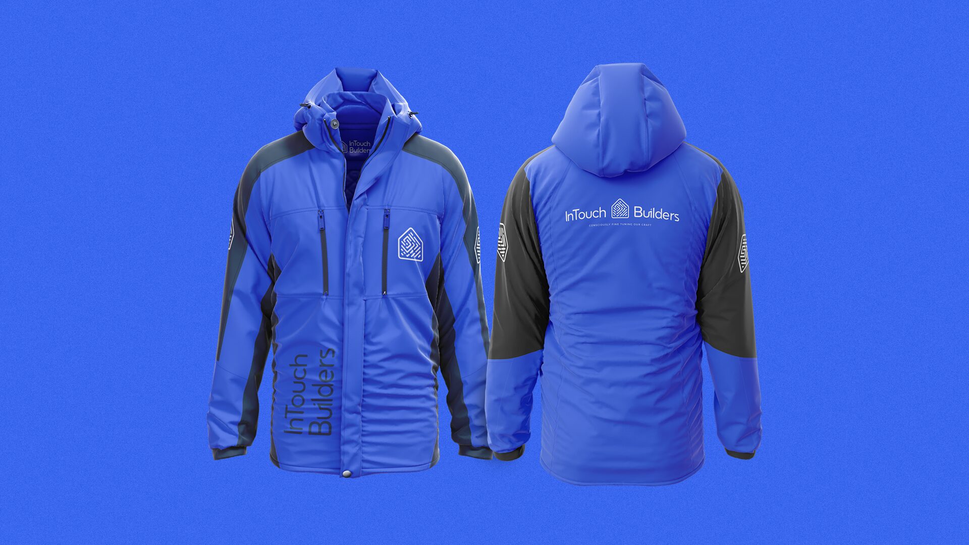
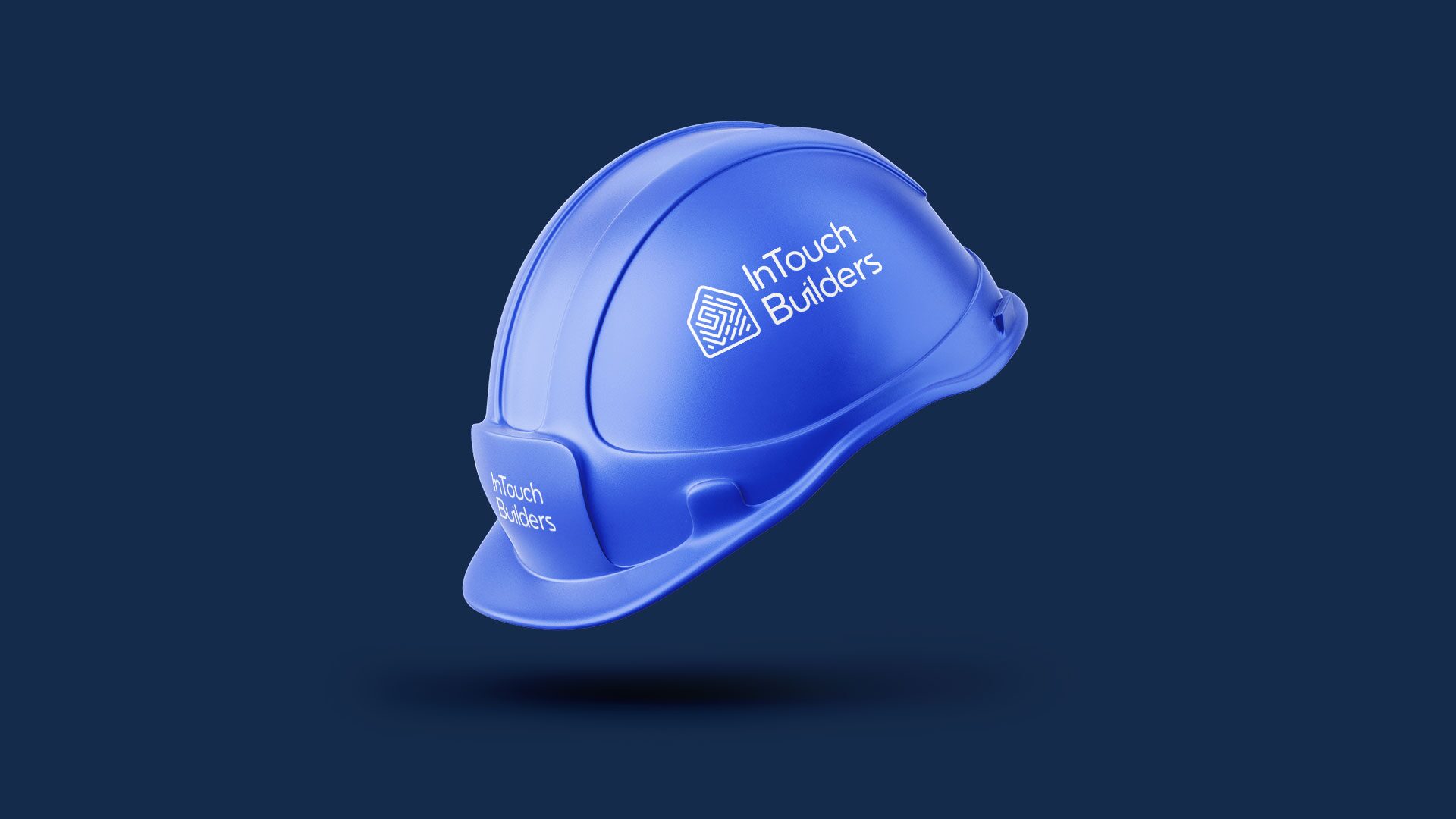
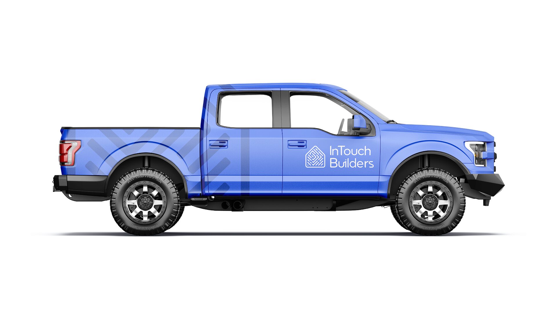
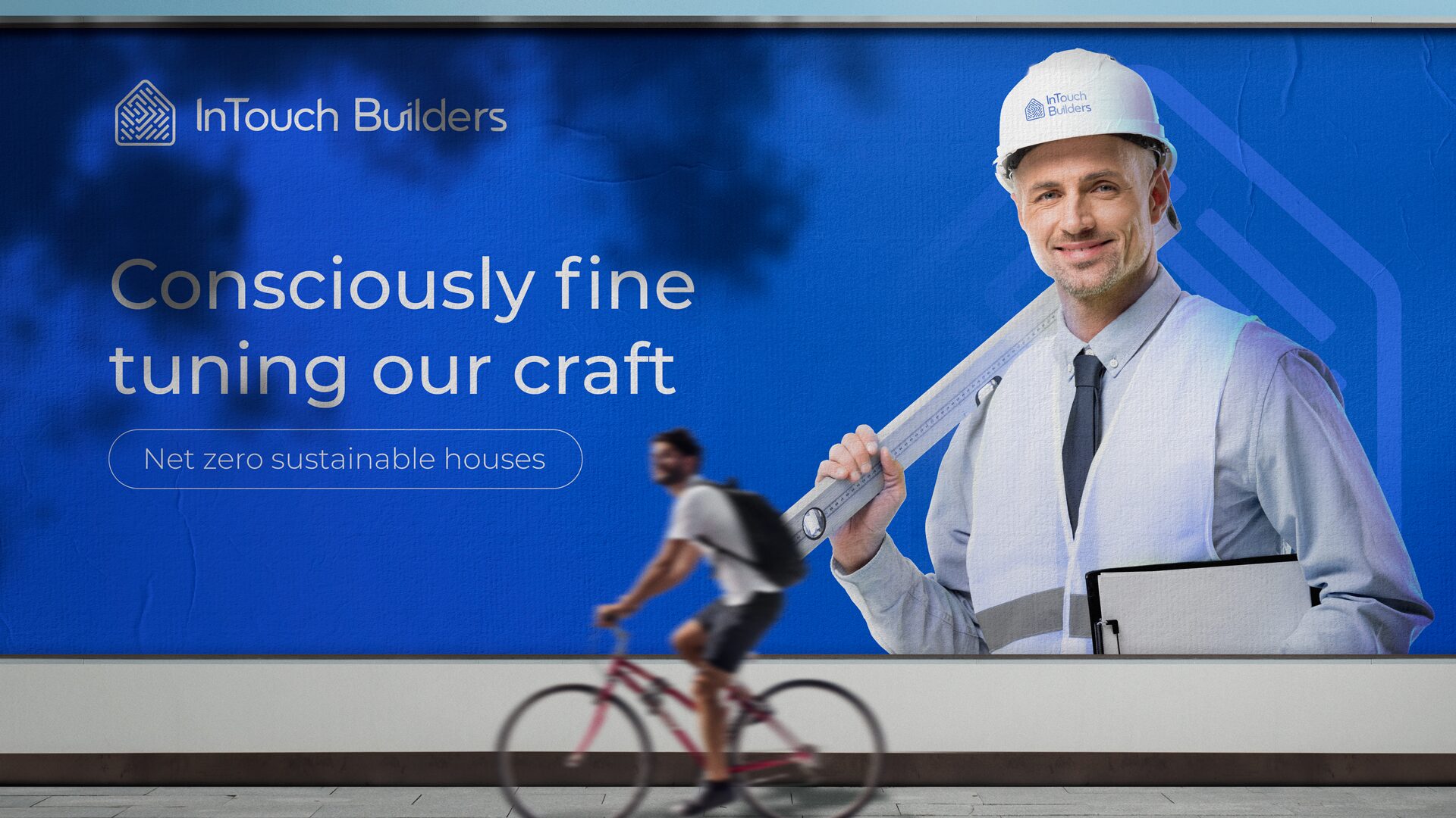
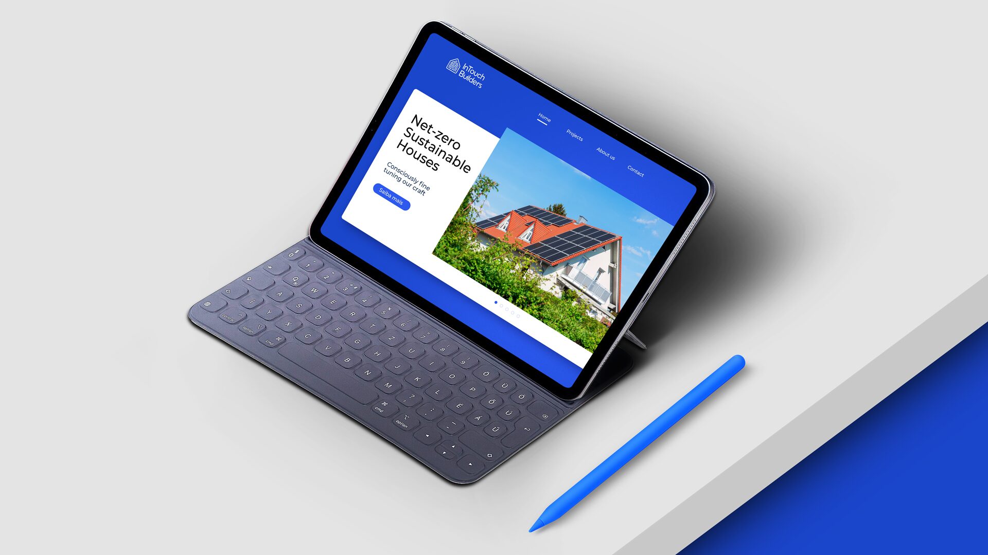
FIG.01–FIG.17 ARE THE SYSTEM'S OWN ARTWORK, UNTOUCHED. THE HERO BAND IS THE BRAND'S OWN FRAME REMASTERED WITH NANO BANANA PRO AT 4K FROM THE ORIGINAL AS REFERENCE, THEN DOWNSCALED TO 2560 PX FOR DELIVERY.