CASE 02 / BRAND + PACKAGING SYSTEM
Puckin'
Sour
CLANDESTINE LABZ
BRAND · PACKAGING · MARKETING
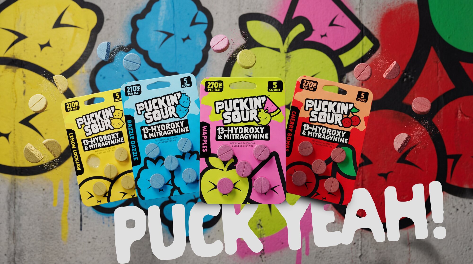
Not a drink.
Not a gummy.
Just a tab.
Clandestine Labz had a functional botanical tab — kratom alkaloids and kava — landing in a category that mostly looks like a supplement aisle. Beige pouches, wellness type, leaf iconography. Nothing that a 21+ buyer picks up off a counter on impulse.
So we built it as sour candy instead. A drawn wordmark with a pucker star hidden in the letterforms, a crew of fruit characters caught mid-pucker, and an acid palette coded to flavour — then held that system across two blends, four flavours and six pack formats without letting the compliance side get loud or the brand side get quiet.
The brand shouts. The label states. That separation is the whole discipline.
Bold. Playful.
Just puckin' loud.
The pucker crew
FIG.01 / FLAVOR MAP — ONE FLAVOR, ONE ATTITUDECherry Bombs
CHERRY · RED
Lemon Lockjaw
LEMON · ACID YELLOW
Razzle Dazzle
BLUE RASPBERRY · CYAN
Wapples
GREEN APPLE · CHARTREUSE
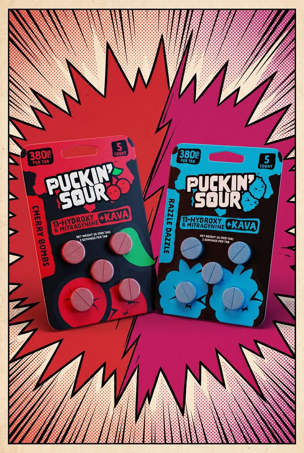
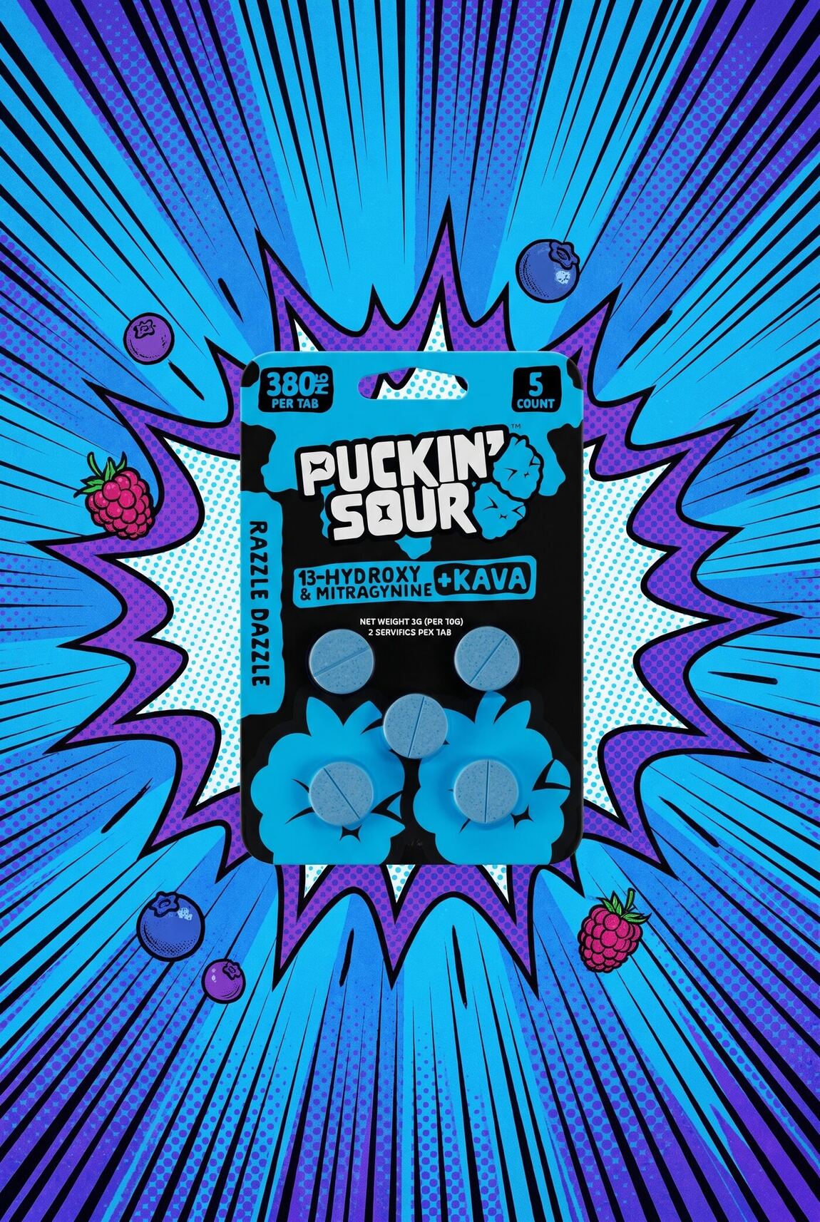
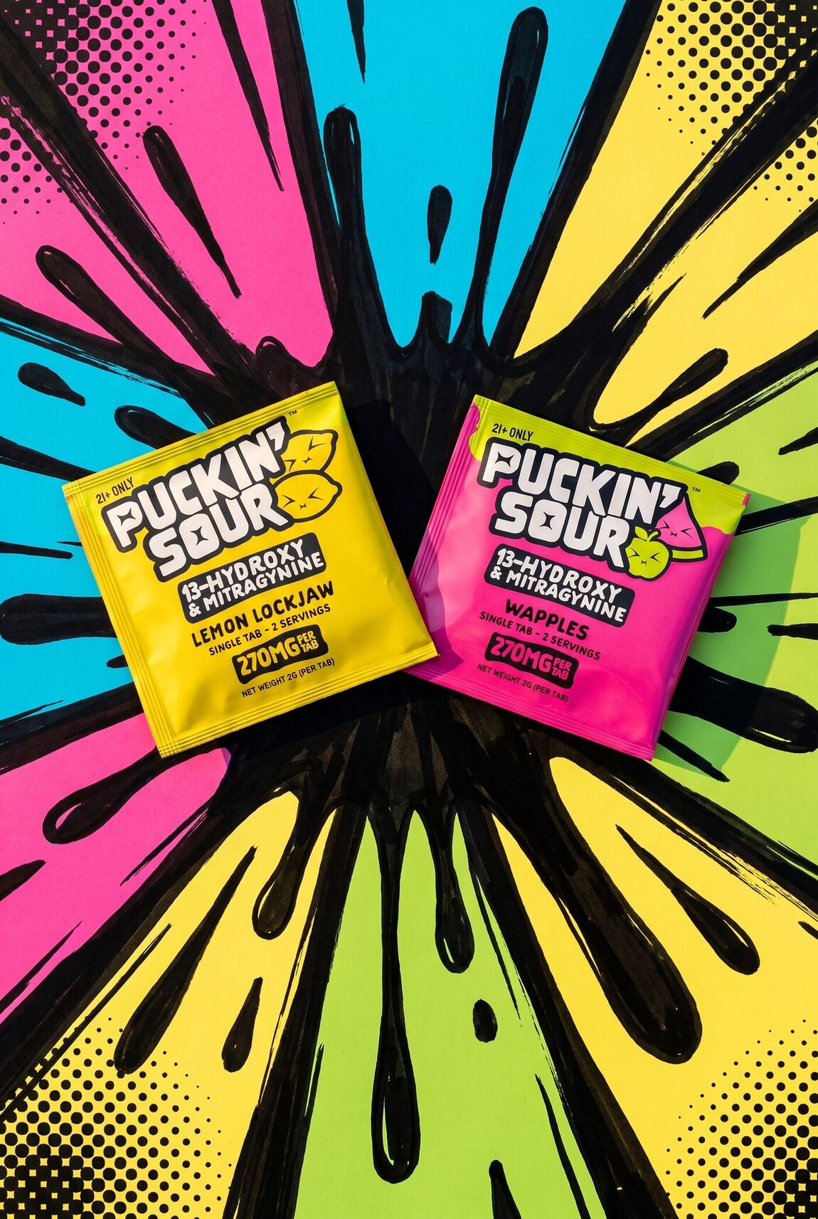
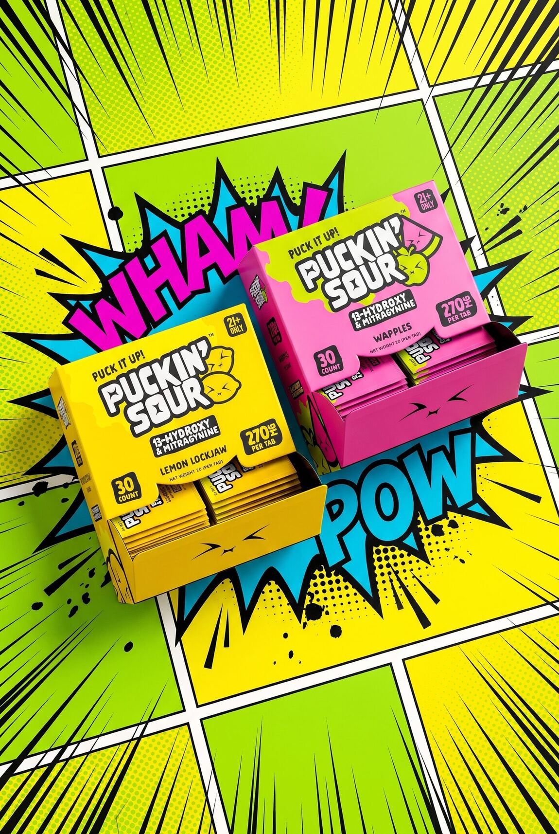
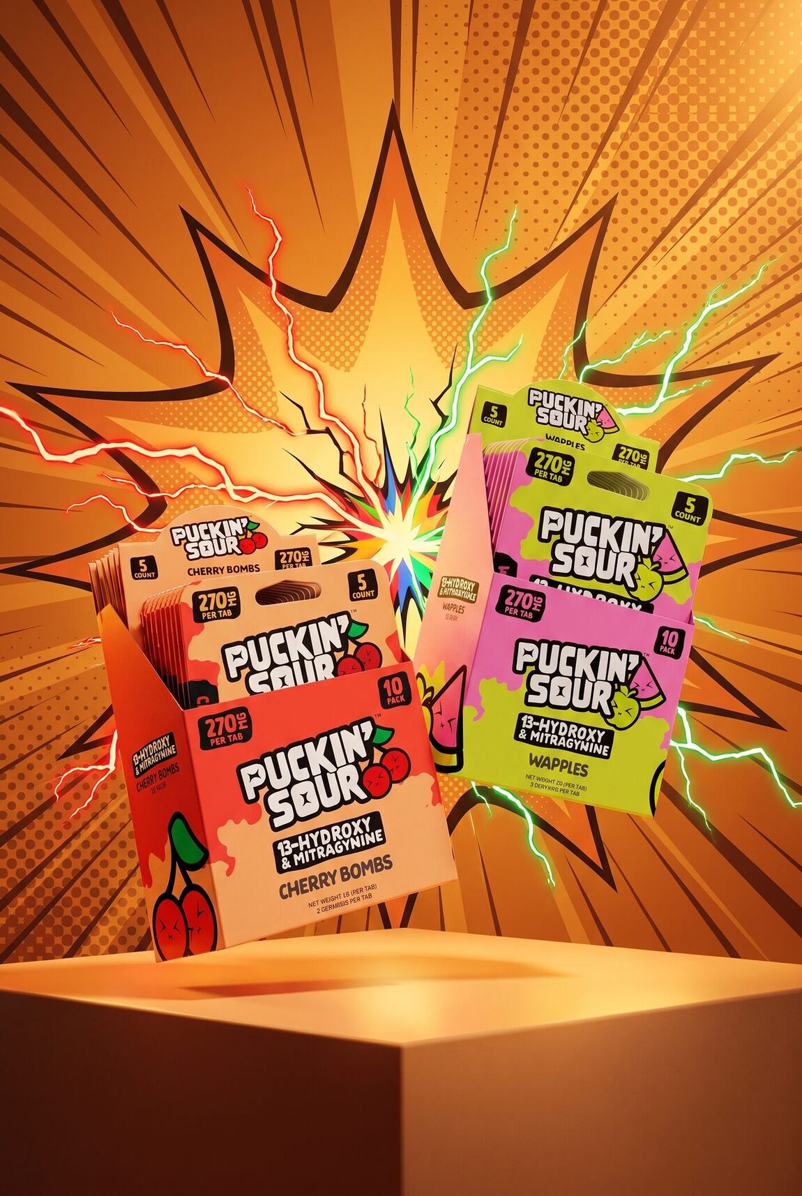
Puck it up
FIG.02 — FIG.07 / MARKETING CONTENT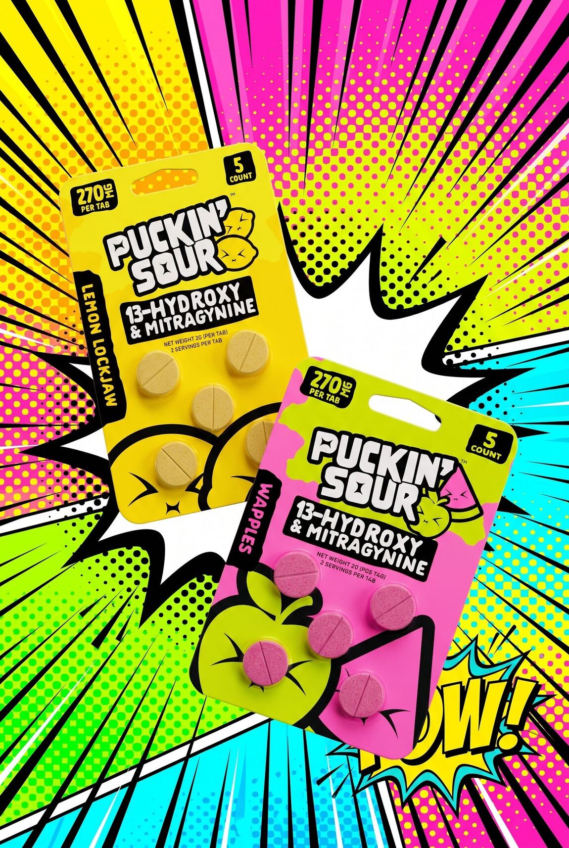
The finish
FIG.08 / SPOT GLOSS — RAISED VARNISH ON MATTE BOARD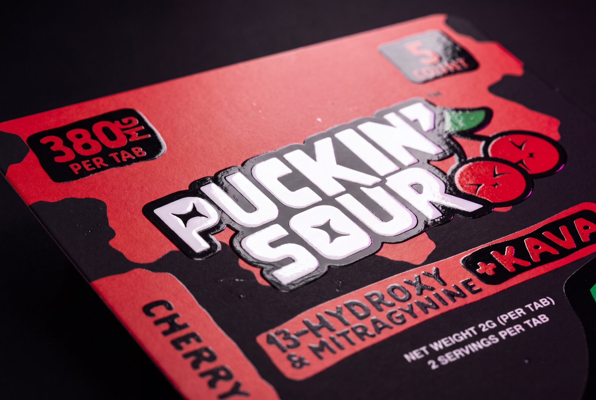
Gloss on what
shouts.
Every SKU ships with a second print file — a spot gloss layer, drawn separately from the artwork, that tells the printer exactly which shapes get raised varnish.
We put it only on the brand: the wordmark, the dose badge, the count badge, the flavour tab, the blend banner and the PUCK IT UP! on the back. The Product Facts panel, the ingredient list and the warning block stay dead matte.
So the finish does the hierarchy physically. Tilt the card under a shop light and the brand catches it while the label stays quiet — the same rule the layout follows, enforced in varnish.
- ◆PUCKIN' SOUR WORDMARK GLOSS
- ◆380MG PER TAB BADGE GLOSS
- ◆5 COUNT BADGE GLOSS
- ◆FLAVOUR SIDE TAB GLOSS
- ◆13-HYDROXY + KAVA BANNER GLOSS
- ◆PUCK IT UP! — BACK PANEL GLOSS
- ◇PRODUCT FACTS · INGREDIENTS · WARNING MATTE
4 FLAVORS × 2 BLENDS × 4 FORMATS — 32 SEPARATE SPOT-GLOSS FILES, ONE FOR EVERY RETAIL FACE.
On the floor
FIG.09 / +KAVA BOOTH — CHAMPS, LAS VEGAS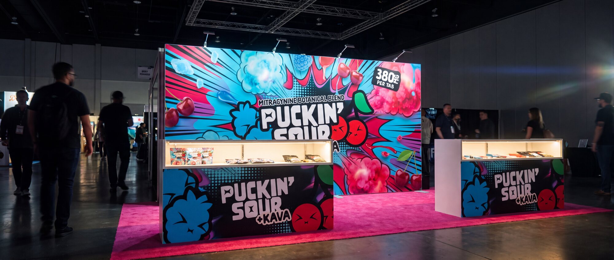
Readable at
forty feet.
A show floor is a wall of noise. Every booth is shouting, and a buyer walking the aisle gives you about a second and a half of peripheral vision to earn a second look.
So the backdrop drops everything except the thing that carries: the wordmark, huge, white on hot pink halftone, with the pucker stars sitting in the P and the O where counters would normally be. No paragraph, no product grid, no strapline competing with it. The pack does the detail work at the counter — the wall only has to stop someone walking past.
20×10 BACKDROP · 17.5FT WALL · 6FT SHOWCASE COUNTER · HANGING BANNER — BUILT FROM THE SAME ARTWORK AS THE PACKAGING.