CASE 01 / PACKAGING SYSTEM
American
Standard
AFTERMATH DISTRO
KIT + POD PACKAGING SYSTEM
They came to us
mid-flight.
American Standard had concepts on the table from another studio and none of them were landing. What had moved was nothing: the print window, the flavor count, the launch. Ten SKUs across four formats still had to be drawn, drafted, proofed and signed off, and the calendar had already spent its slack.
We picked it up from there and carried it to press-ready files — every date hit, the full line in market on time.
Ten flavors,
one set of rules.
American Standard needed a packaging system, not ten packages. Four formats — kit and pod, single and master box — had to carry ten flavors without the structure drifting a millimetre between them.
So it starts at the die and works forward. One artboard per SKU on an identical die, a locked keyline layer nobody touches, Pantones measured once and shared across every SKU, one barcode per flavor. The colorway is the only thing allowed to move. Everything else — the Texas Heritage frame, the transparent-device callout, the warning panels — holds position across all ten.
Drawn, drafted, built, rendered and shot in one studio. No handoffs, no coordination tax, nothing lost between vendors.
One SKU, end to end
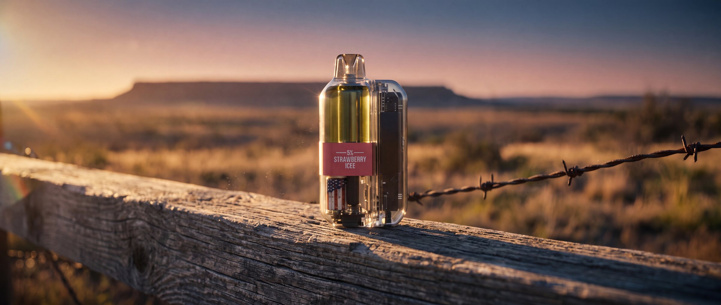
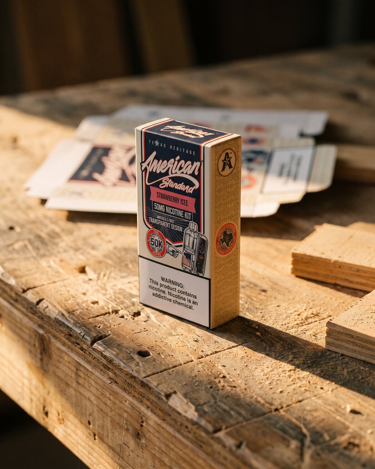
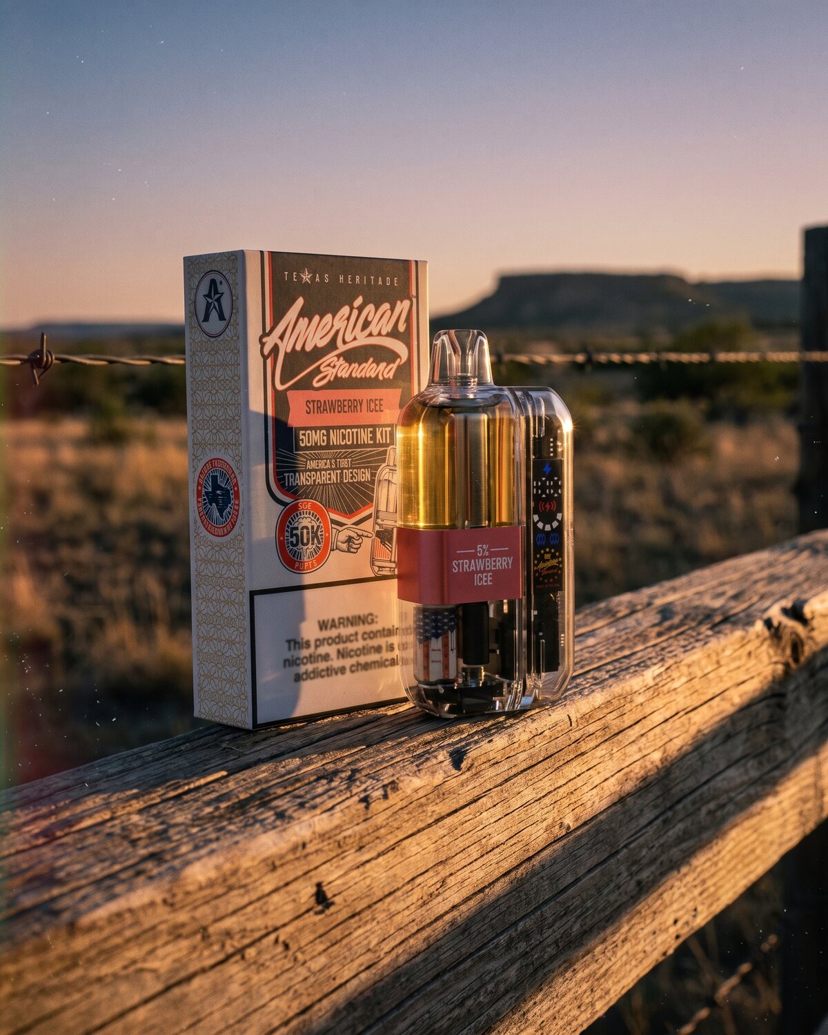
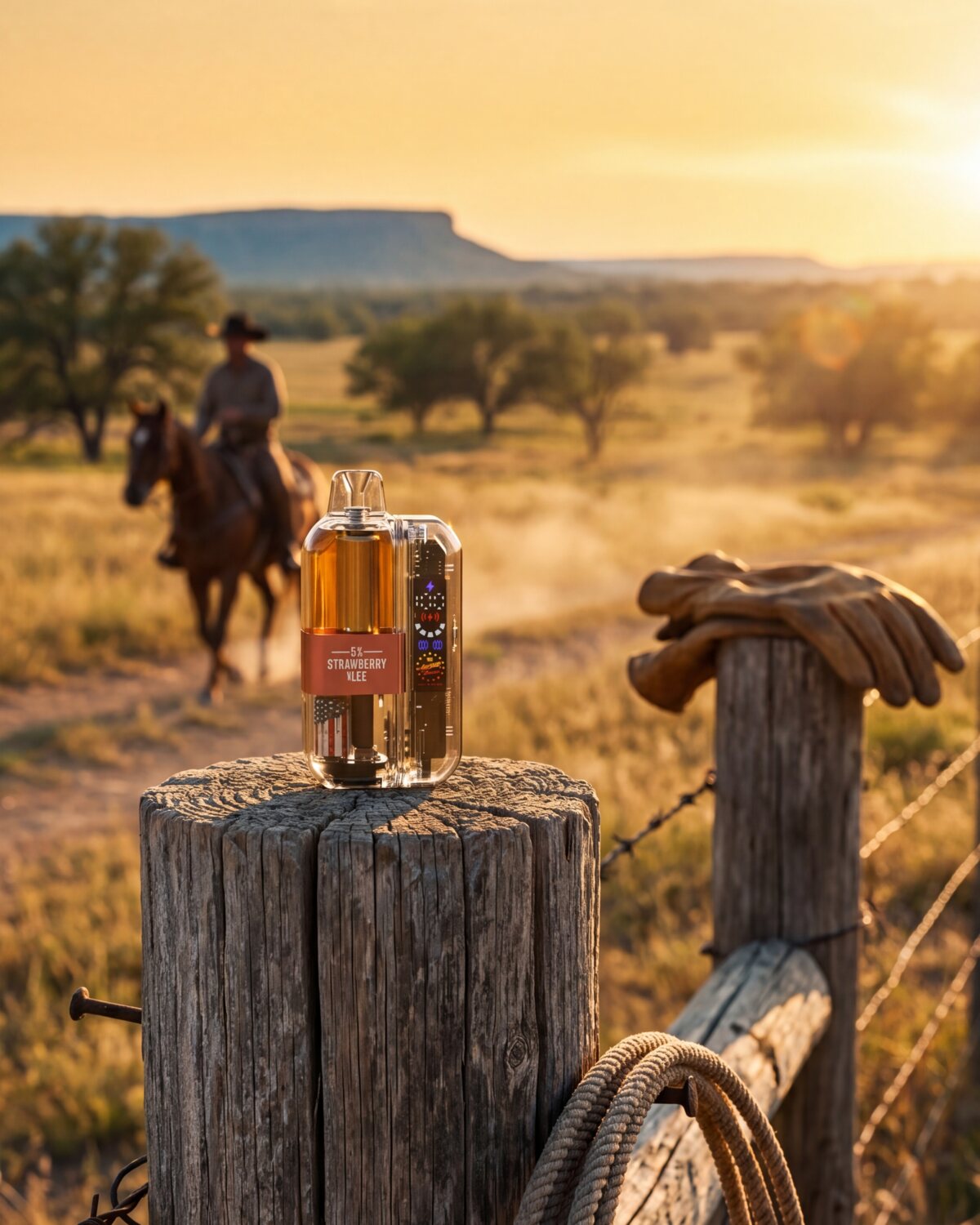
FIG.01 — FIG.05 / STRAWBERRY ICEE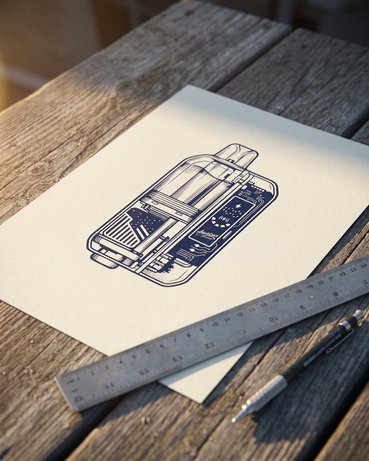
Inside the file
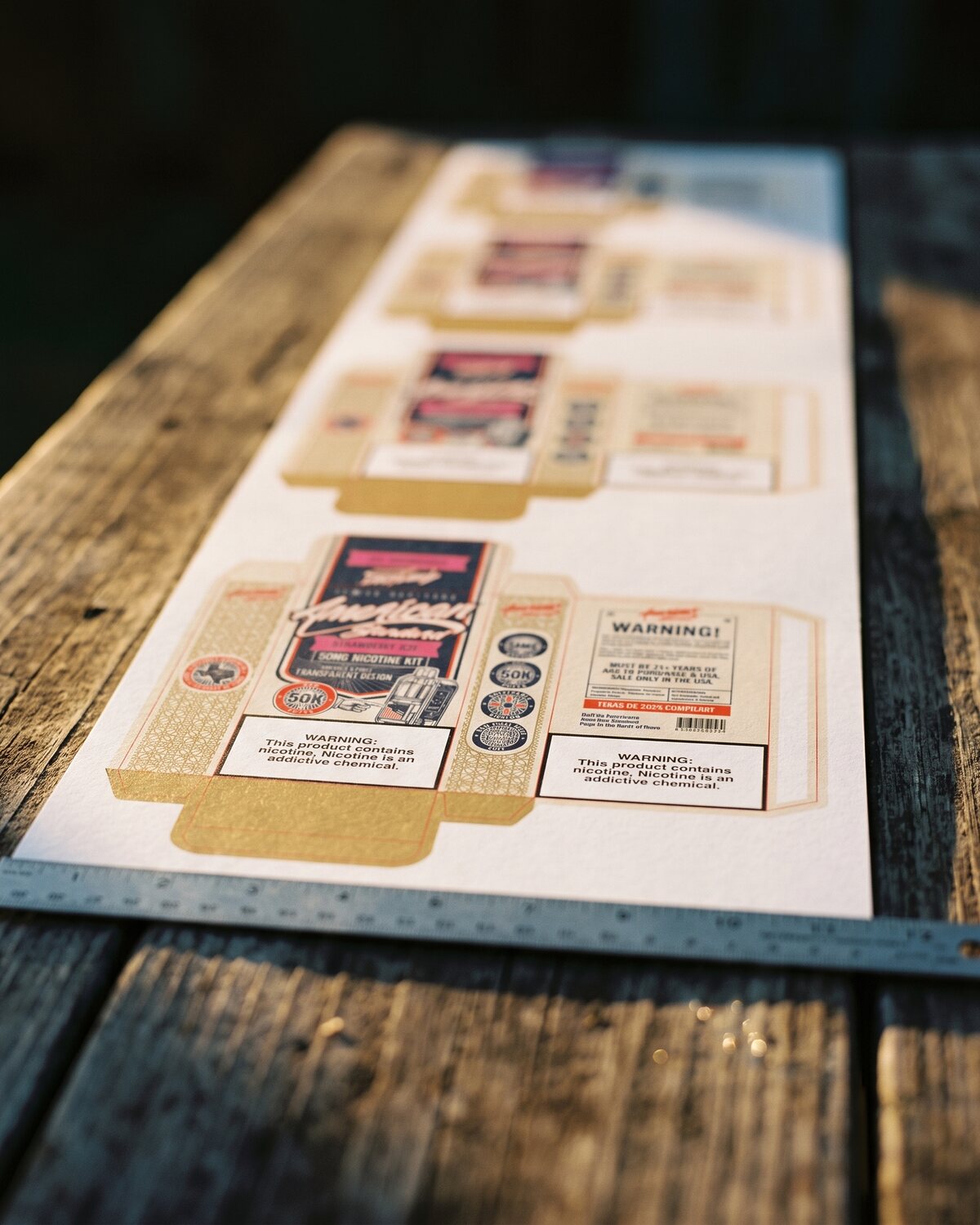
FIG.06 / KIT SINGLE — PRINT MASTER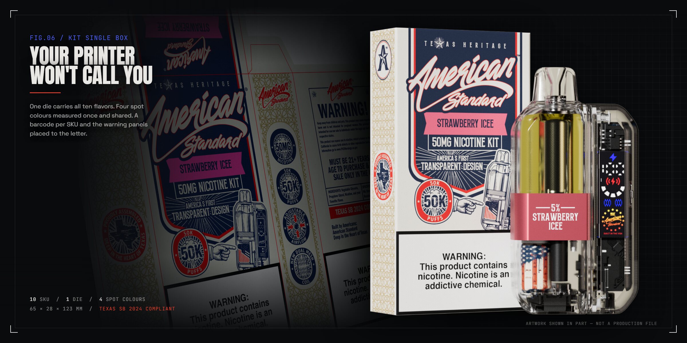
The boring part
is the product.
Four spot colours measured once and shared: navy 540 C, red 48-15 C, gold 11-11U and cream 1-9U, with 1777C carrying the flavour. Panel dimensions called out on the die. A barcode per SKU. Warning panels sized and placed to the letter, and TEXAS SB 2024 COMPLIANT where the regulator expects to find it.
This is the part nobody puts in a portfolio, and it is the part that decides whether your launch date survives contact with the printer.
On the floor
FIG.07 — FIG.09 / TRADESHOW + POS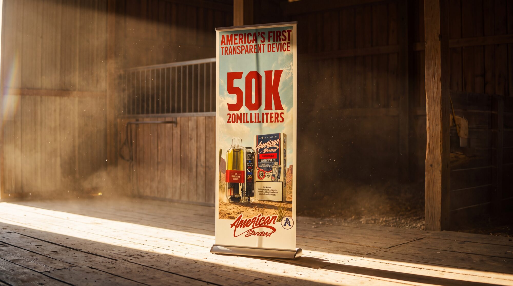 FIG.07 PULL-UP BANNER 01 — AMERICA'S FIRST TRANSPARENT DEVICE
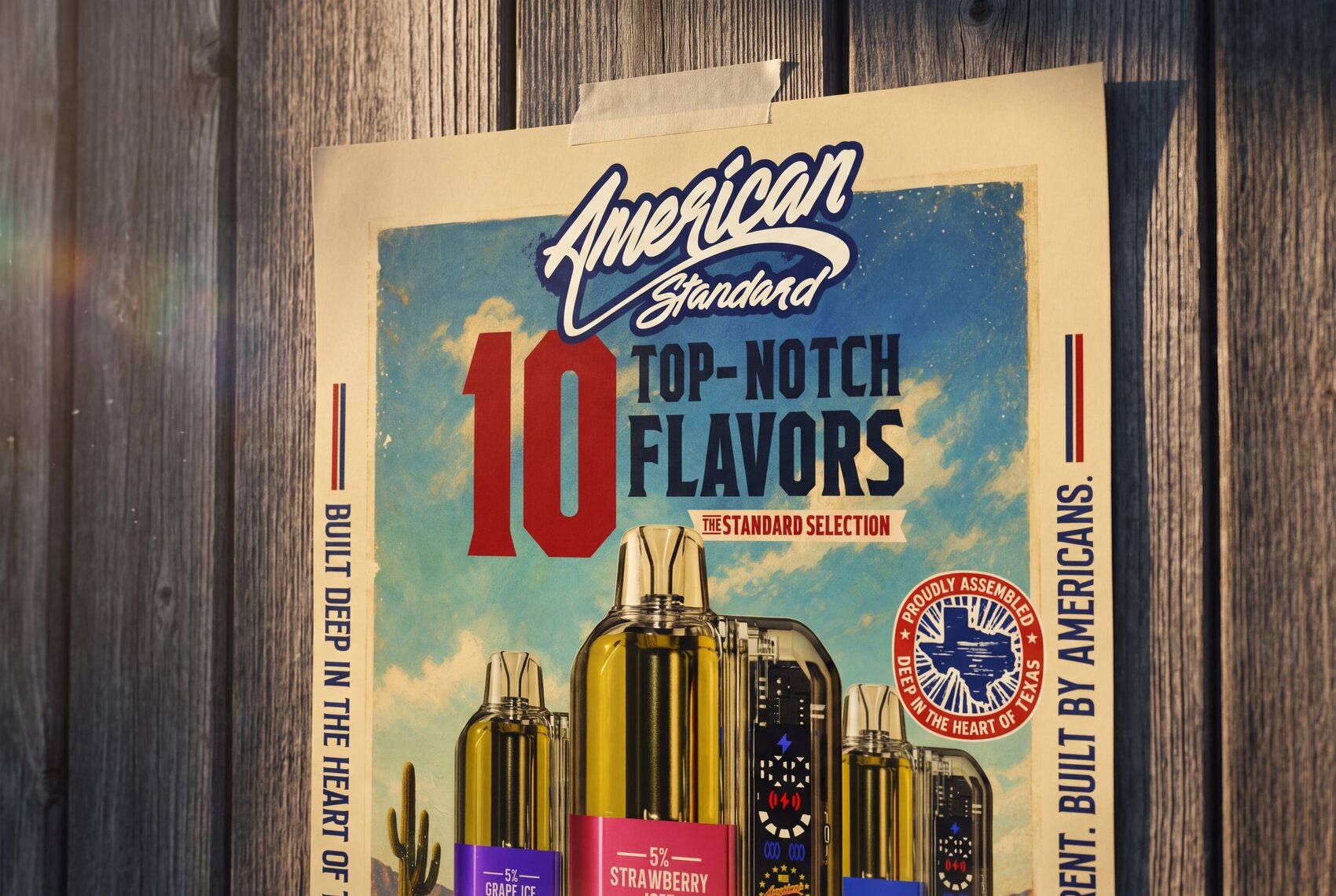
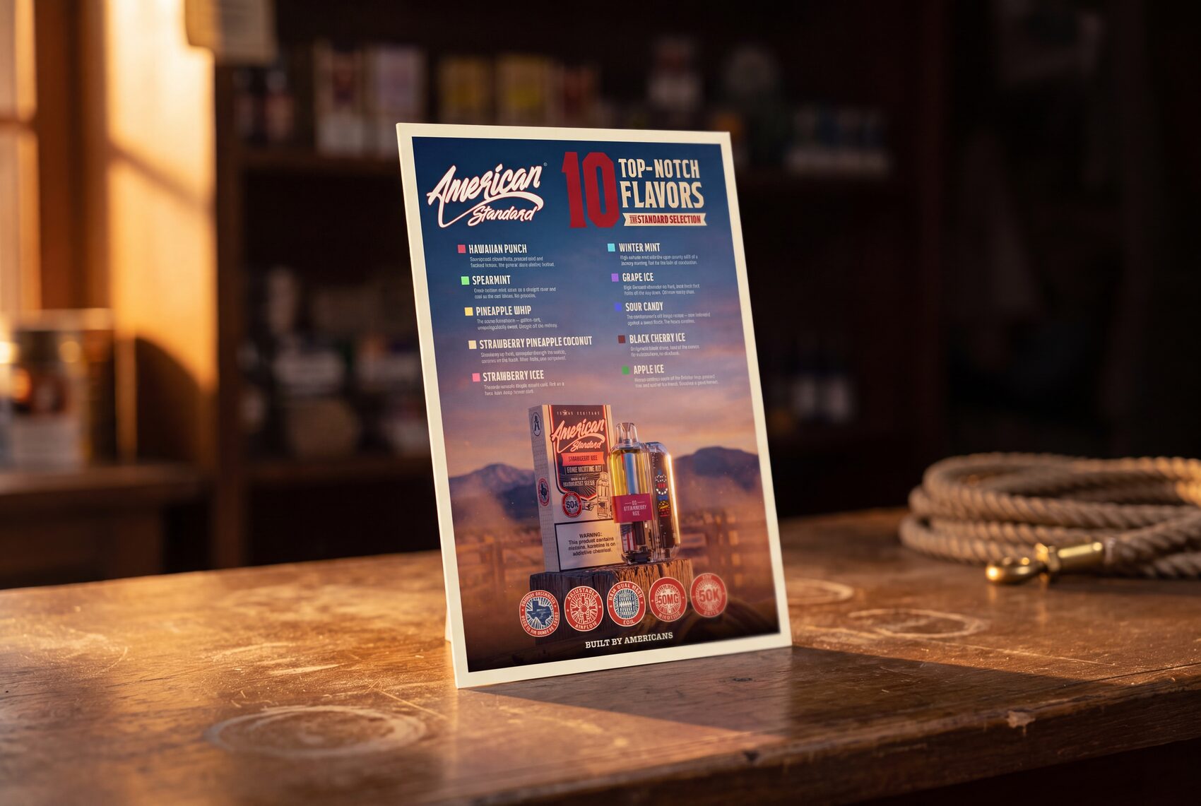
BANNERS, POSTER, FLAVOR CARD, TABLE TENT AND STICKERS — DRAWN FROM THE SAME FILE AS THE CARTON, SO THE BOOTH AND THE SHELF SAY THE SAME THING.
Off the shelf, into the world
FIG.10 — FIG.13 / CAMPAIGN SET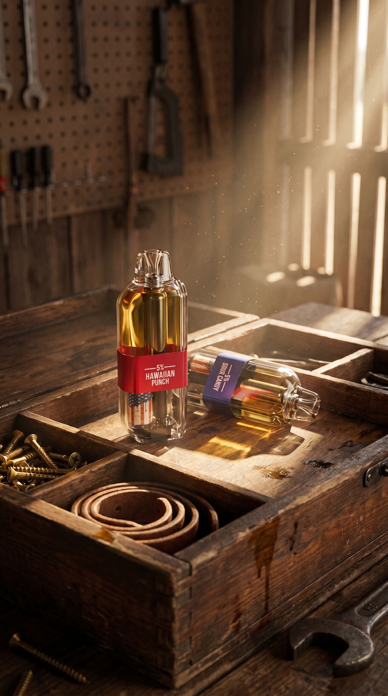
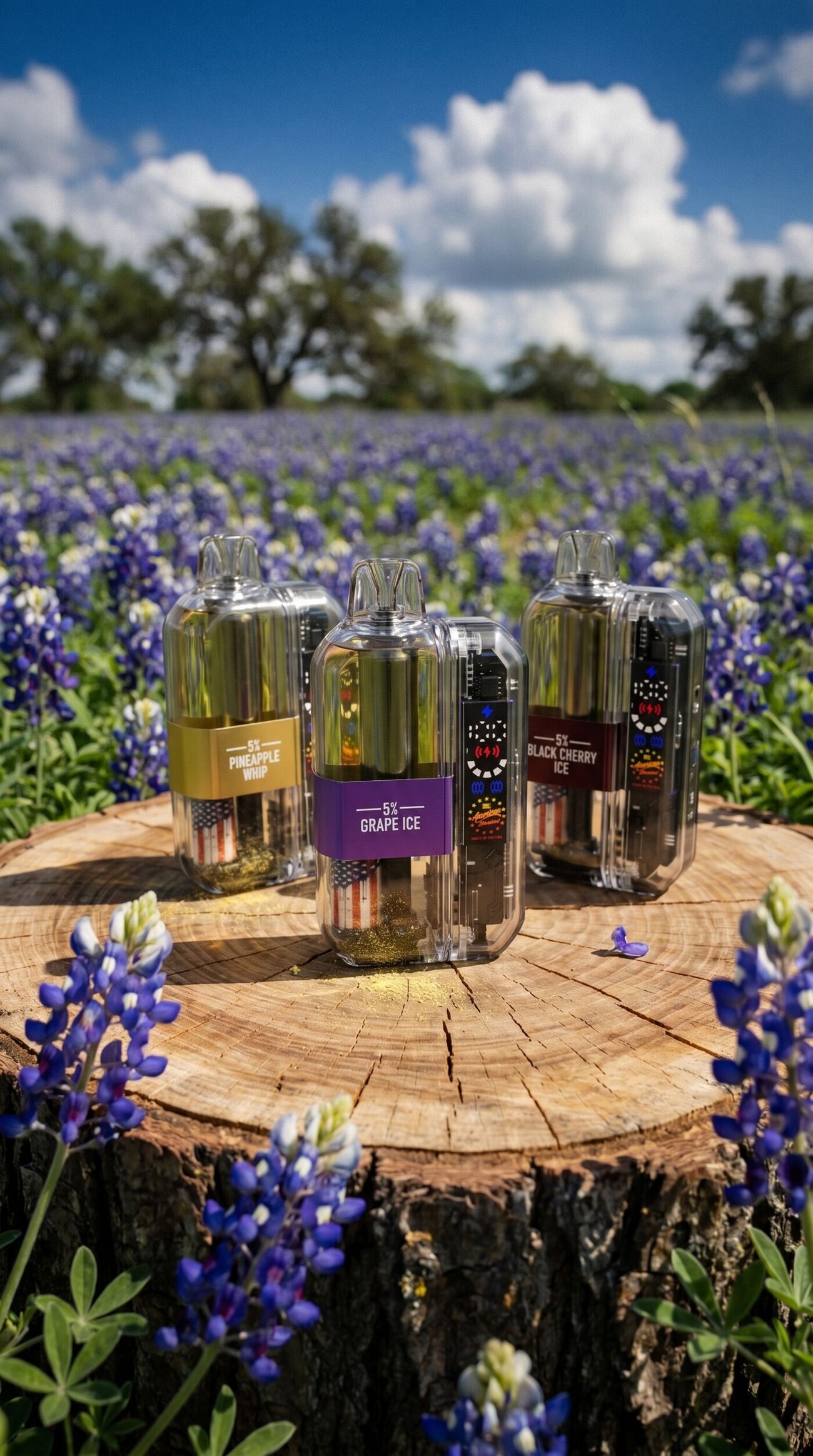
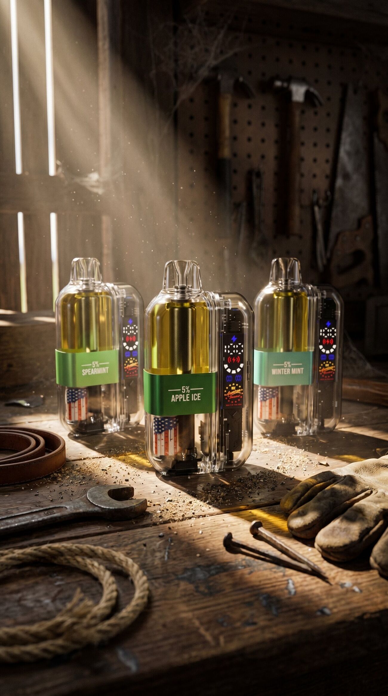
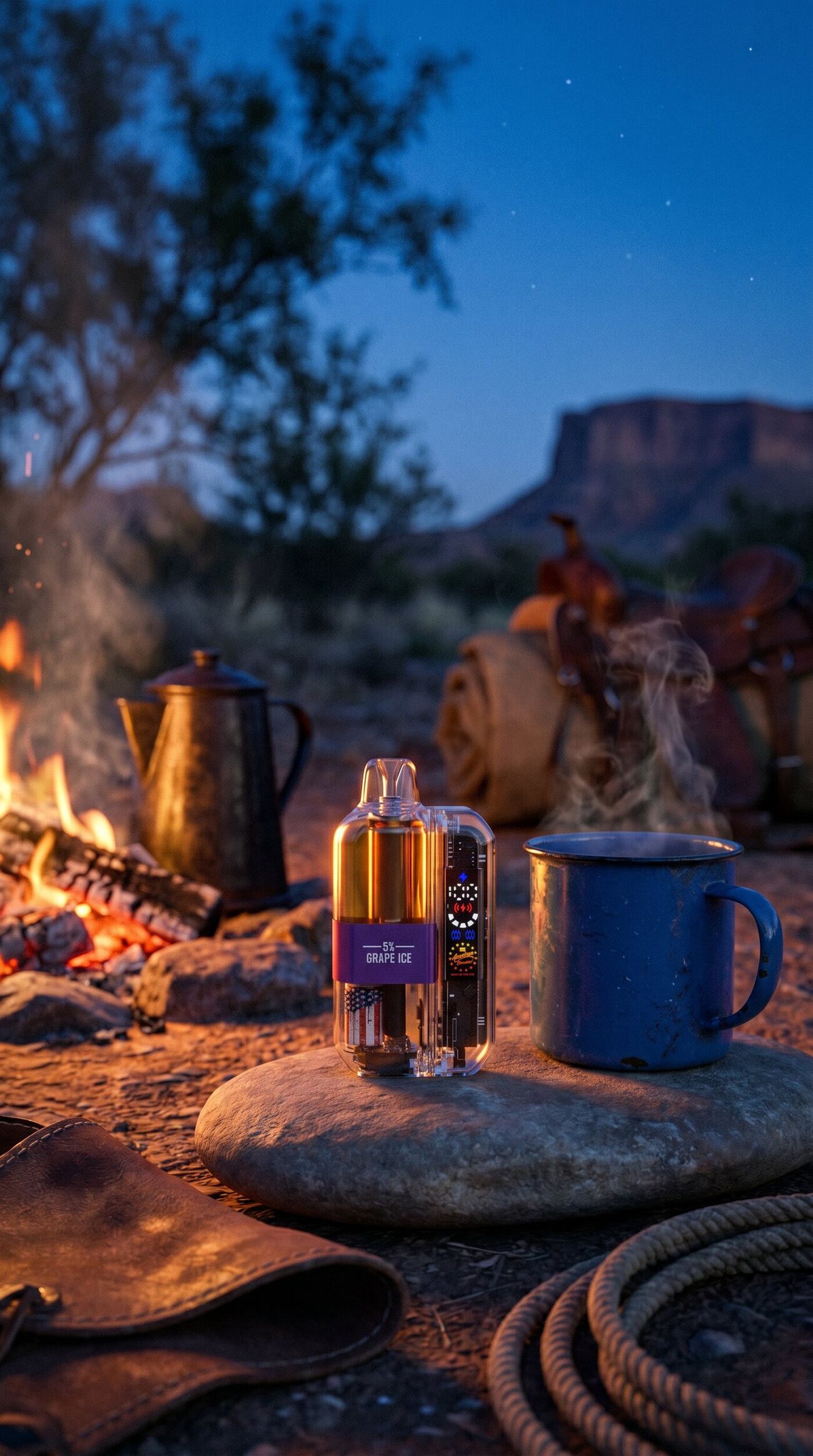
DEEP IN THE HEART OF TEXAS WAS ALREADY ON THE CARTON. THE CAMPAIGN JUST TOOK IT OUTSIDE.
The spot
FIG.14 / :40 BRAND FILMSame studio,
all the way out.
The film closes the loop. The line that was drawn on a die and proofed against Pantone chips ends up on screen, cut to the same story the carton has been telling since the first panel — built different, built by Americans, deep in the heart of Texas.
One studio carried it from the first drawn line to the last frame. Nothing was briefed out, nothing got lost in a handoff, and nothing had to be re-explained to a second vendor halfway through.