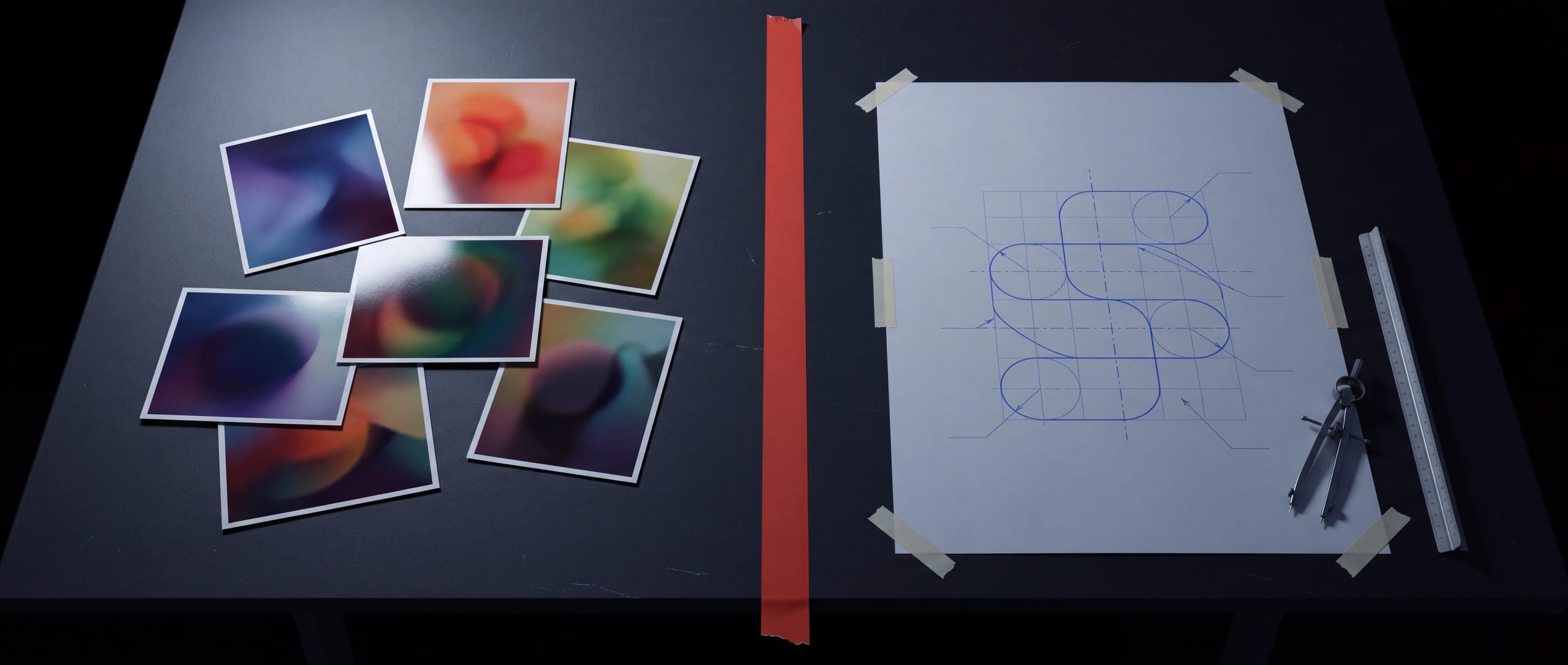
01The brief changed
Two years ago a first email looked like this: three links, a competitor we should "feel like", and a photo of a bottle from a shelf in another country.
Now it looks like this: a shared folder, forty images, a name that may or may not be available, and one sentence. Can you make this real?
The client has already done the part everyone used to charge for. They found the feeling. They burned through two hundred generations to get there, and by the time they reach us they are certain about the look and completely uncertain about everything underneath it.
That is not a worse brief. It is a better one, arriving in a format nobody can manufacture from.
02What actually lands in the inbox
Five shapes, over and over.
- The vibe deck Forty images that agree on a mood and on nothing else. Frame 6 and frame 31 are two different companies.
- The almost-logo A mark that reads beautifully at 1200px and dies at 12mm. Soft edges, a stroke that changes weight halfway round, no geometry underneath it.
- The pack that will not unfold A carton shot at three-quarter view with a panel that does not exist, seams that meet nowhere, and a lid that cannot open.
- The misspelled hero The best image in the folder, and the product name has two Rs.
- Make this, but real One frame carrying a whole company's worth of intent.
None of these are failures. They are a brief written in a new language.
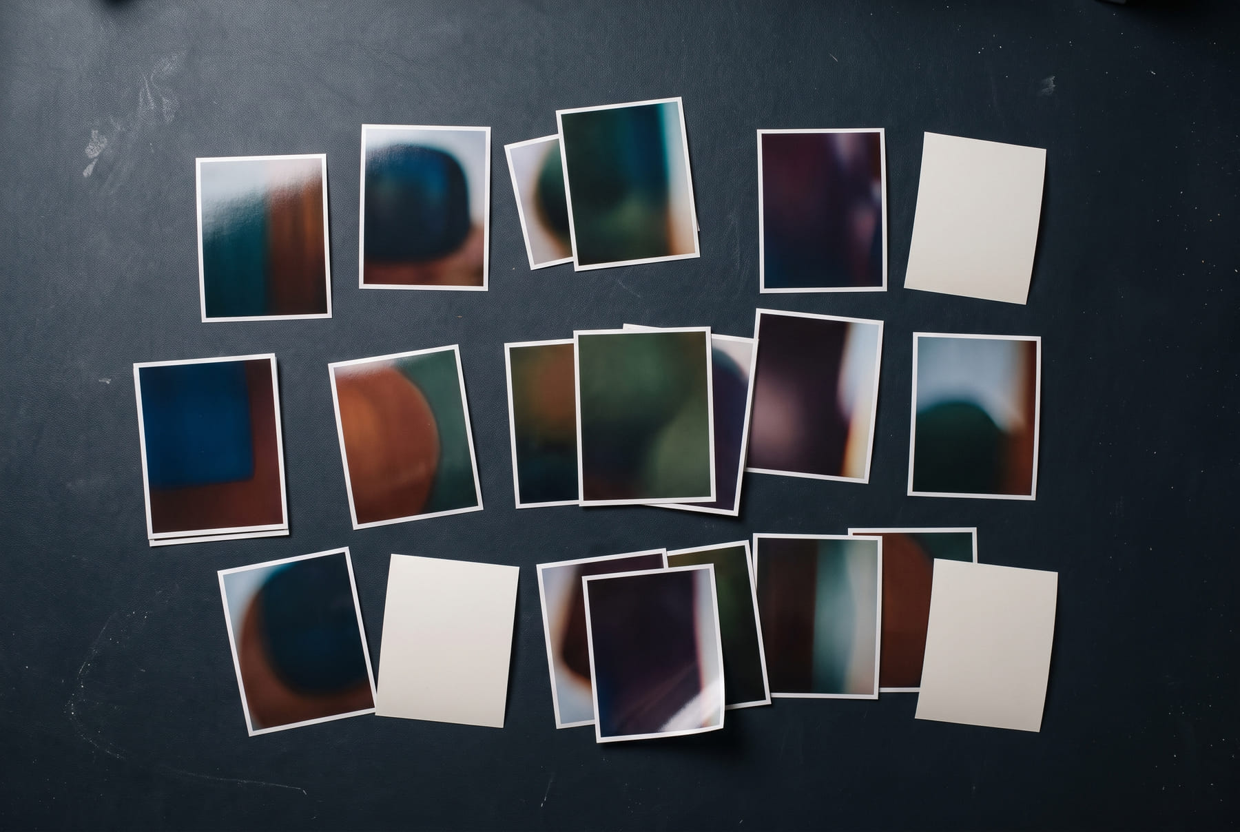
03The concept is the easy ten per cent
Worth saying plainly, because it saves everyone a month.
A picture of a brand is not a brand.
What is missing, every time:
Any one of those is a Tuesday for a studio. All seven at once is why the folder has been sitting for three weeks.
04We keep the intent, not the pixels
The mistake is treating the generated frame as artwork to be traced. It is evidence.
We read it the way you read a photograph of a building you want to commission: what is load-bearing, what is decoration, and what is an accident of the light that day.
- What repeats Across forty frames the thing that survives is the idea. Usually one gesture, one material and one colour relationship.
- What the client points at They will say "this one" about frame 12 and then describe frame 30. The gap between those two is the actual brief.
- What the model could not do Small type, a repeating module, an exact count, a real material behaviour. That absence is usually where the strongest decision is hiding.
By the end of a scope call we can normally say the brand in one sentence. That sentence gets built. The forty images are retired.
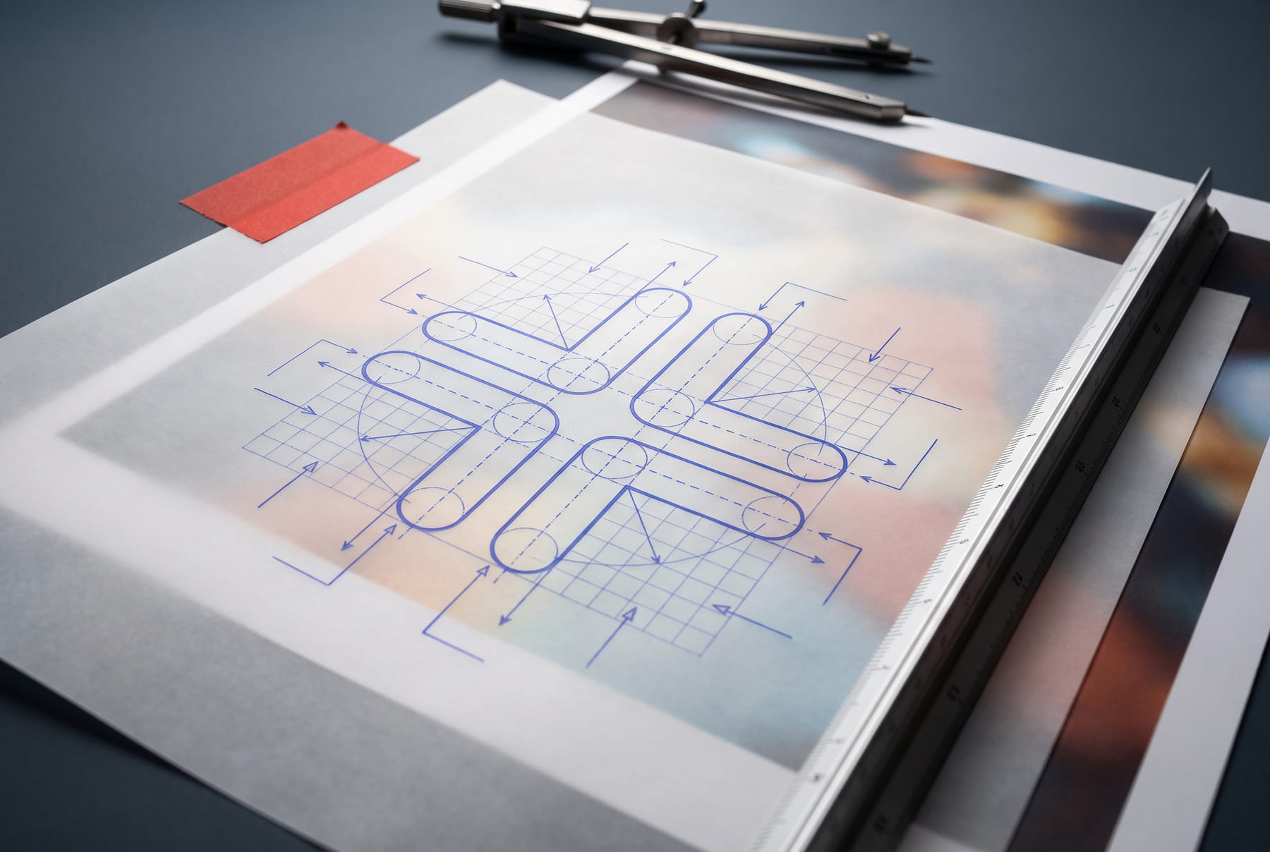
05How we get it done
Draft, Build, Deliver — same as always. What changed is what goes in the first box.
DRAFT
- Interrogate the concept One call. What is this object physically? What is it made of? Who picks it up, and where does it sit?
- Pull the through-line One sentence, one gesture, one palette relationship. Everything else is noise from the generation run.
- Redraw the mark Real geometry, on a grid, with construction logic — modules, radii, stroke weights that hold. Not a trace. A rebuild. If a mark cannot survive being drawn properly, it was a texture, not a mark.
- Settle the type Licence a real family, or draw the letters as artwork with a licence we can hand over with the files.
- Convert colour into a system Spot, process, screen. Coated and uncoated. Nailed to physical references, not eyeballed off a JPEG.
BUILD
- Structure before surface Dieline, or real 3D geometry, or both. Panels that exist, folds that fold, a bottle that could be tooled.
- Apply the system to the structure Flat art on the die, at size, with bleed. This is the step that finds every problem the concept was hiding.
- Photograph the result Here we pick up the same tools the client
used, and put them under discipline:
- The artwork goes in as a locked reference. The model renders the environment, the light and the shadow. It gets no vote on the product.
- Every legible line in frame goes into an exact-text lock. Anything not on that list is framed out of legibility on purpose.
- Composition is specified numerically — subject height as a percentage of frame, base position, lens, rotation in degrees. A repeatable set, not a lucky frame.
- A negative prompt lists every failure the set has produced before, including the specific misspellings.
The model never draws the logo.
It renders a blank plate — a real panel, correct size, correct standoff, correct shadow gap — and the actual vector lockup is perspective-warped onto it afterwards. The mark in the finished image is the mark in the files. Every time.
DELIVER
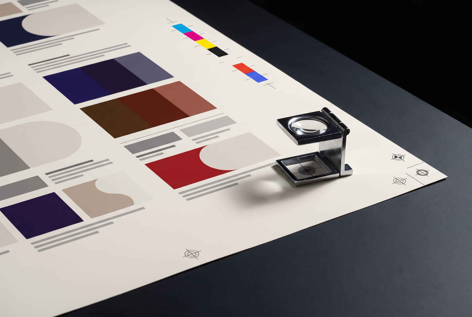
- Preflight and proof Press-ready PDFs, correct separations, bleed, overprint. Checked on paper, not on a screen.
- A master set Vectors, dielines, colour specs, type licences, usage rules.
- A handover that survives us Anyone can open the files and build the next SKU without calling.
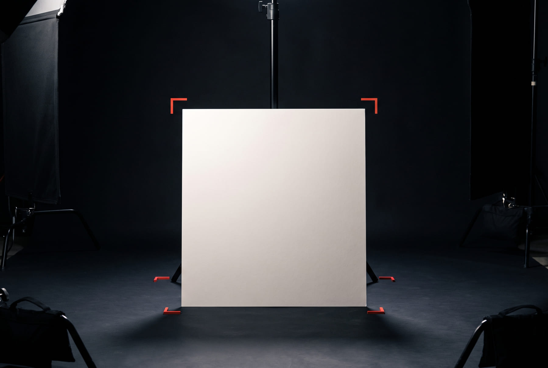
06Where we use AI, and where we will not
Straight answer, because clients ask and most studios dodge it.
- We use it for Environments, light, cast shadows, the surface a product sits on, background plates, blocking a scene before a real render, mood alternates, and expansion or clean-up on plates we already shot or built.
- We do not use it for The mark, the typography, the dieline, the colour spec, any legible line of copy on a package, or anything the client will own and defend. Those are drawn.
The line is simple. If it is going in the files, a person drew it. If it is the room the files are photographed in, the machine can help.
07Two from the floor
CASE 03 SAGA — ARCHITECTURE
The concept called for a modular symbol — a kit of pieces that assemble into an S, then rearrange to build the A, G and A of the name. Ask a model for that and you get a soft calligraphic S with no module logic at all, which throws away the whole idea. So the symbol was drawn, the wall was generated blank, and the real lockup was warped onto the plate.
Read the Saga caseCASE 01 AMERICAN STANDARD — RETAIL PACK
The carton carries a nicotine warning that has to be legally exact. Eight lines locked word for word, five palette hexes locked, camera height and subject scale specified as percentages of frame, and a negative prompt naming every misspelling the set had already produced. The set came back consistent because the failures were written down.
Read the American Standard case08If you have an AI concept, send us this
You do not need to tidy it up first. You need to send the right five things.
- The whole folder, unfilteredIncluding the ones you rejected. What you rejected tells us more than what you kept.
- Your three favourites, rankedOne line each on why. "The weight." "The colour against the shadow." That is enough.
- The object, physicallyWhat it is, what it is made of, how big, who holds it, where it sits. If it is a pack: volume, closure, shelf or e-commerce.
- Anything already committedA registered name, an approved colour, a printer's spec sheet, a warning paragraph legal has signed off. Constraints are cheap now and expensive in week six.
- The real deadline, and what it is attached toA trade show is a different project from a soft launch.
What you do not need: a brief document, a mood board, or a cleaned-up folder. We would rather see the mess.
09The point
The tools moved the starting line. A client can now arrive holding a picture of the thing they want, which is genuinely new and genuinely useful.
The finish line has not moved at all. It is still a vector file, a dieline, a colour that prints, a typeface you are licensed to use, and a mark that holds at 12mm.
That is the part we do. Send the folder.
FIG.01–FIG.04 AND THE HERO BAND WERE GENERATED WITH NANO BANANA PRO UNDER THE SAME DISCIPLINE THIS ENTRY DESCRIBES — NUMERIC COMPOSITION LOCKS, A FIXED PALETTE, AND A NEGATIVE PROMPT THAT BANS LEGIBLE TEXT OUTRIGHT. NOTHING IN ANY PLATE IS A REAL CLIENT'S ARTWORK.